WINNER
Super. Human
by 4creative, for Channel 4
Channel 4’s original ‘Superhumans’ campaign had been so successful that, a decade after launch, some disabled people felt it had inadvertently created a new disability stereotype in the form of the sports superhero.
The broadcaster’s response was to tear its most iconic campaign in two. Rather than showing the athletes from the Paralympic Games as ‘super’, it decided to instead emphasise their human side. The objective was to show the sacrifices athletes make to reach the top, while reclaiming emotive and negative uses of language and turning them into bold statements of excellence. Once again the campaign sought to reframe how the world sees Paralympians and disability.
The stylised visuals of the campaign sought to reflect real life – beautiful at some times and messy at others – alongside the years of work, injuries, bruises and blisters it takes to reach the Paralympics.
The judges said: “Kudos to 4creative for recognising the issue and having the guts to address it. A powerful campaign, which properly moves into your head for a while.”
HIGHLY COMMENDED
D&AD Exhibition in Taiwan
by Ken Tsai Design Lab, for National Taiwan University of Science and Technology
The National Taiwan University of Science and Technology brought the internationally-recognised D&AD Awards to a Taiwanese audience with an exhibition that set out to explain just what the famous yellow pencils mean.
Combining the pencils with recognisable fruits from Taiwan saw to show ‘what’s inside the pencil’, drawing people inside the touring exhibition. The initiative also provided workshops for new designers by established mentors.
Audiences were nearly one third bigger than at previous exhibitions as a result of the campaign.

Altogether Different
by 4creative, for Channel 4
At a time when UK society is arguably more divided than ever, Channel 4 used its first brand platform campaign in a decade to argue for greater acceptance of difference in a land of oddballs.
With its ‘Altogether Different’ campaign, the broadcaster set out to tackle the notion that differences should divide us, by countering that it is in fact our shared sense of uniqueness that brings us together. It also found time to highlight Channel 4’s role in offering alternative, vibrant and bold programming to represent those who might not feel they fit in elsewhere.
A centrepiece film, focused around on-screen talent, kicked off by calling everyone in the UK ‘weird’ before backing up its assertion with evidence that included Stonehenge and Gogglebox. It was supported by posters and radio ads that mashed together different shows with surprising and surreal results.
Guardian 200 Years, a Work in Progress
by OLIVER, for The Guardian
As a brand that has never shied away from taking a view at odds with orthodoxy, The Guardian celebrated two centuries of publishing not by celebrating past achievements but by looking towards what comes next.
Adopting a creative platform and campaign line that acknowledged that its mission to bring truth will never end – “The Guardian. For 200 years, a work in progress” – the brand stayed true to its roots in news reporting with a copy-based approach. Press, display and social ads, along with podcasts, films and DM executions all featured headline-like messages that reflected The Guardian’s boldness.
The celebration proved to be one of the most successful campaigns The Guardian has ever mounted. It boosted awareness with its target audience, improved affinity amongst existing readers and delivered significant financial support. The newspaper says the campaign has laid successful foundations for the next 200 years of reporting.
Alice: Curiouser & Curiouser
by Hingston Studio, for Victoria and Albert Museum
After an extended period of closures due to Covid-19, the V&A wanted to celebrate its reopening with a blockbuster summer show.
Alice: Curiouser & Curiouser was that show. Its opening was highlighted in advance with a broad variety of messaging tactics to create as much interest, and drive as much excitement, as was possible. Based around a contemporary take on vintage circus posters, the campaign was thoroughly modern in the way it was optimised for digital and social platforms.
Featuring individual characters from Lewis Carroll’s stories allowed movement, with Alice shot as live action then animated with a stop-frame aesthetic while other characters were designed especially for the campaign. The characters moved around dynamic messaging that stretched and contracted, playing with the exploration of perspective and size that is so important to Alice’s journey.


Brand Campaigns

shortlisted


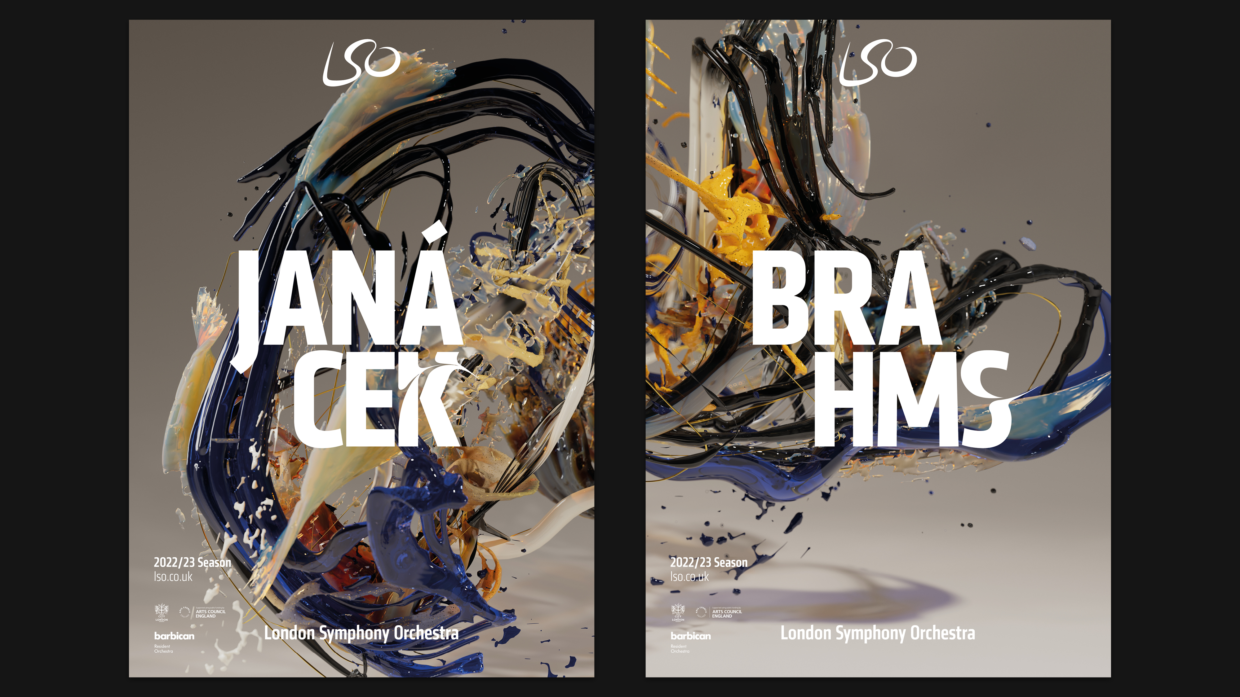
Master Conductor
by Superunion, for LSO
Conductor Sir Simon Rattle, who has been at the heart of the London Symphony Orchestra’s visual identity since he joined it in 2017, will be leaving after the 2022/23 season.
Since 2017 the LSO has used motion capture data of Rattle’s movements while conducting to shape and inform its visual identity and campaigns. Each season a new film has been created, with a digital artist interpreting the theme of the programme.
Superunion was briefed to create a campaign for Rattle’s final season, paying tribute to his artistry with ‘The Master Conductor,’ which draws a parallel between music and art.
Working with a digital artist the agency transformed gestures of Rattle conducting Bartók’s Miraculous Mandarin into an expressive art-piece with painterly textures and a sculptural physicality.
Nike Air Max Day Kids 2022
by ManvsMachine, for Nike
Nike was seeking to bring ‘Kid-vision’ to the world, via the lens of its Air Max range, as it launched its first kids-only innovation product in the form of The Air Max Motif.
The brand had a key objective to forge a bold and exciting connection with its audience, to inspire all future aspects of the visual language to be used by Kids Air Max.
ManvsMachine worked with Nike to create a full brand system that included an array of Air Max-inspired assets, such as a 3D bubble typeface and an expansive 3D graphic library. The system was designed to celebrate the innovation of Air Max while sparking the imagination of its young target audience by illustrating a lighter approach to life – one based on a sense of fun, freedom and a dose of surrealism.
