WINNER
The Dissolving Bottle
by BBDO Guerrero
To help combat the 8 billion tons of plastic waste that pollutes the ocean every year, BBDO Guerrero created The Dissolving Bottle, an innovative shampoo bar that aims to be appealing as well as sustainable.
According to the studio, shampoo bars are a great solution to plastic pollution, but most people get them confused with bars of soap. To avoid this, it chose to design the bar in the shape of a bottle, hence the name The Dissolving Bottle.
The name also intends to highlight its key benefit and communicate the concept effectively. BBDO’s brief was to devise a shampoo bar that would appeal to a range of end-users: travellers, home-use, and resort-owners.
The studio focused on designing a robust shape that would be comfortable to grip, developing a 3D-printable mould for easy replication. The unique font embossed directly onto the product eliminates the need for paper and printing and the colours of the range seeks to reflect the natural ingredients.
In its place of development, the Philippines – a nation of over 7,000 islands where plastic pollution of the sea is prolific – the product is set to be a success with people and institutions looking for a sustainable alternative to shampoo in a bottle.
The judges said: “Super creative and avoids plastic. Helps consumers understand the product with a very neat solution.”
HIGHLY COMMENDED
Lasting Impressions
by Matter, for Fay Page
Matter’s packaging design for jewellers Fay Page was inspired by life on the tiny island of St. Martin’s in the Isles of Scilly and intended to reflect the brand and the islander’s stewardship of their natural surroundings.
The studio wanted a clean construction with no print, plastic, or glue so it decided to use blind emboss & deboss artwork on the surfaces of the packaging. In an attempt to keep the design sustainable, Matter used GF Smith 'Colorplan' papers with natural tones and textures.
Handwritten messages and maker’s marks on the matchbox packaging aim to give full flexibility and a personal touch, with a wool cushion to protect the jewellery.
Ultimately, the design is meant to embody the simple, sustainable lifestyle of people on the island and invoke a sense of place.

Wainwright Colours from Nature
by James Cropper
Wainwright Colours from Nature is a capsule collection of papers made with 100% recycled fibre and dyed with natural ingredients. The product is certified to the FSC® recycled label and the content is a mix of 40% post-consumer waste and 60% locally sourced (UK origin) pre-consumer waste processed through an on-site CupCycling facility.
The design involves plant-based dyes never before used in papermaking – which come in the colours Limestone and Herdwick Brown – in an attempt to create a new sustainable solution. James Cropper is working on diversifying and investigating botanical dyes extracted from things like plants, shells and fungi.
The studio says the dyes have a great binding efficacy to cellulose, ensuring they are bound fast to the paper fibres and not wasted. Designed primarily for the packaging and publishing sectors, the paper is supposedly bleed-free, rub resistant, and biodegradable.
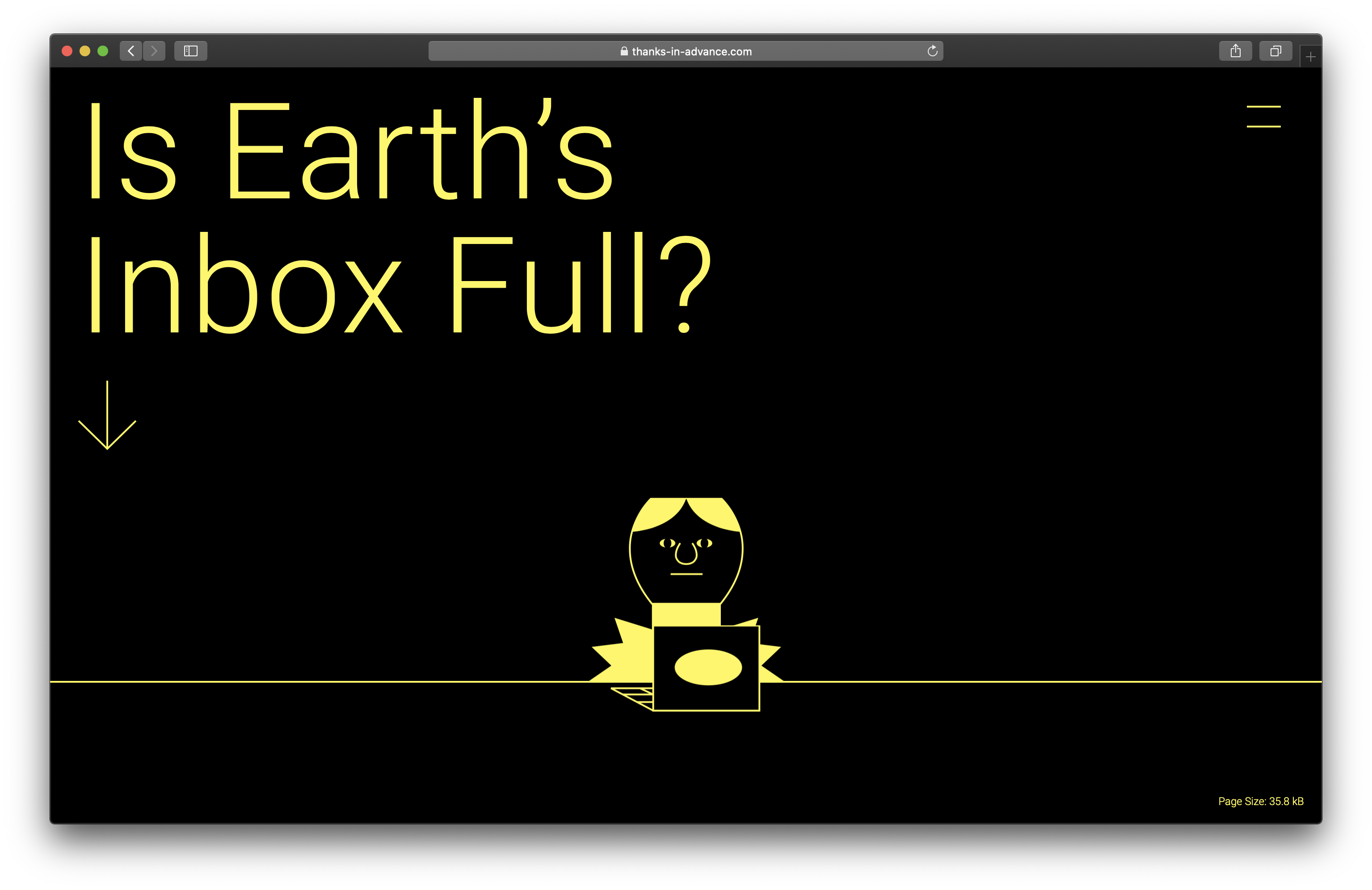
Thanks in Advance
by Anyways Creative - credit to Dan Powell and
Jose Flores
Thanks in Advance is a low-energy website created by Anyways Creative that aims to explain and contextualise an issue that not many people think about day-to-day – digital hoarding.
The studio says that while the carbon cost of a single email inbox is small, the collective effort of changing our digital habits such as deleting emails could be huge. With sustainability at the heart of the project, Anyways designed the website to be as low-energy as possible.
Every creative decision was balanced between the impact on the experience and environment, according to Anyways, including the decision to make Thanks in Advance a single static web page. In collaborating with illustrator Jose Flores to create images using a high contrast colour palette, the studio aimed to deliver images in the lightest file size possible.
Attempting to further reduce its overall carbon footprint, the website is hosted by a green provider and uses a carbon aware analytics programme. The studio says these design choices resulted in a site that is greener than 97% of other sites.
Air Heroes
by Engine, for E.ON
Engine has designed Air Heroes capes for sustainable energy leader E.ON, which it says is the first piece of clothing designed to actively remove pollution from the air. Air Heroes was created to help E.ON encourage children to walk to school and reduce CO2 emissions.
The design of the capes is meant to appeal to kids, with each cape including an insert called the Breath which absorbs and disaggregates harmful particles in the air. The studio says that this patented fabric can remove two petrol cars' worth of pollution over the course of a year.
Considering the ever-changing British weather, Engine designed each cape to be fully waterproof and included a base panel made from highly reflective 3M material to improve safety. The studio collaborated with fashion brand Scamp & Dude for the project.
The Air Heroes campaign launched at the start of the school year, supported by a digital film that involved podcasters and influencers. Engine says that the capes sold out from the Scamp & Dude website in record time and post-campaign results showed that 31% said they wanted to walk to school more often.


Design, Climate, Action: designing sustainably

shortlisted