WINNER
San Francisco Symphony
by Collins, for San Francisco Symphony
When the 108-year old San Francisco Symphony transformed its programming approaches and passed the baton to visionary conductor and composer Esa-Pekka Salonen, it brought in Collins to help clarify, define and express this new vision. The consultancy was tasked with helping the Symphony re-assert classical music as a “crucial, global contemporary art form”, while simultaneously remaining rooted in its community.
The Symphony’s explorations in emerging technologies informed a design direction based around digital, sonic and typographic experimentation. Collins created a responsive, evolving visual system that aims to bring the dynamic qualities of classical music to life. Traditional typography is used as a nod to the art form's heritage, and is augmented with responsive and variable font technology to allow each character to change appearance as it reacts to sound. A new colour palette inspired by the unique colours and landscapes of the Bay Area was created to use alongside more formal black and white tones. Overall, the designs look to “evoke the rich emotional range of symphonic music across an always-changing media and digital landscape,” according to Collins.
The judges said: “I think we have our winner. A perfect piece of branding. It’s brave and beautiful. Expressive in both static and motion. Really sets itself apart from all the other recent rebrands."
HIGHLY COMMENDED
ACMI Identity
by North, for ACMI
ACMI, Australia's national museum of screen culture, recently underwent a AUD40m (around £22m) physical transformation, and needed a new visual identity to embody the organisation's vision to become a multi-platform museum “that goes beyond the physical to bring screen culture to any device, anywhere around the world”. North was asked to create a design system that would be used across the museum's physical assets, marketing materials and its range of digital platforms; and it was important to ACMI that the look and feel would fully integrate as an evolving, multi-platform experience, and “express ACMI's curatorial role in framing the screen culture that is part of daily life”.

M.AD School of Ideas Brand Identity
by Collins, for M.AD School of Ideas
M.AD School of Ideas, formerly known as Miami Ad School, runs programmes in art direction, copywriting, design, strategic planning, UX and more through a global network of 15 schools. Now the school is more than 25 years old, Collins was brought in to create a new identity that celebrated the school’s legacy while “acknowledging education is never static.” Collins created the “M-dot mark” using the M as a fluid form that’s constantly changing and recreating itself, with the dot as a “steadfast counterpoint”. The idea is that this mark reflects the “tensions in constant dialogue with each other” inherent to creativity, as well as passion, discipline, optimism and rigour. To support the new mark, the agency developed a colour strategy that builds on the brand’s existing vibrant pink that’s “true to their Miami roots”.
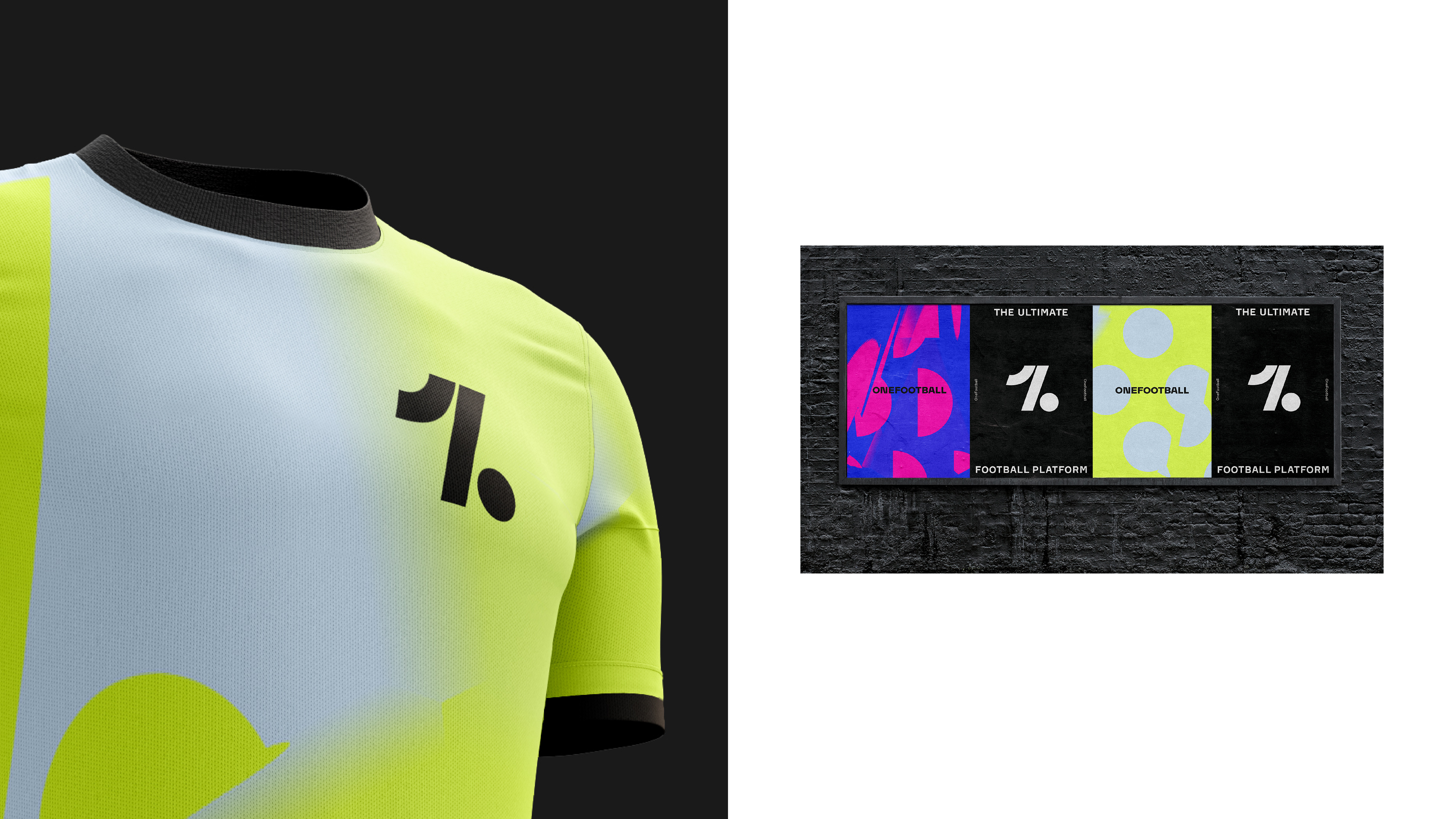
OneFootball
by DesignStudio, for OneFootball
Following a significant growth period in 2019, Football media platform OneFootball brought in DesignStudio for a rebrand that looked to express its brand personality, attract new partners and resonate with all fans, employees and stakeholders. The new look and feel had to elevate it above competitors “and move away from traditional football tropes adopted by football blogs and apps,” says DesignStudio.
Research into OF’s largely Gen Z customer base led DesignStudio to define its new brand personality as the “‘vibesmith’ setting the mood and generating buzz before, during and after the game.” DesignStudio created the brand strategy that OneFootball could “Hype the Game”, which manifested in the “Hype generator” digital design tool. This has three “states”: Fracture, Neutral and Flux, “ranging from jerky movements to flowing motion” and affecting everything from the logo, type and graphic patterns.
The previous icon was taken from the Munich 1972 Olympics icon set, and the new symbol had to be distinctive and adaptable across digital and physical formats at large and small scales. DesignStudio crafted the new logo to resemble the number one, a football, and a person kicking a football simultaneously.
Sculpt Rebrand
by Common Curiosity, for Sculpt
Sculpt, a Birmingham interior architectural studio and workshop, sought out Common Curiosity to create new branding that would create a stronger presence across all touchpoints and echo its principles of “reshape, redesign, refine.” The new branding looked to better communicate Sculpt’s offer and distinct approach, and give greater visibility across promotional materials, proposals and plans, on-site touchpoints and custom material samples.
The foundation of the brand identity is based on architectural plans and focused around a responsive 'S' shape that can scale and adapt, reflecting Sculpt’s principles. This is used to house, section and anchor content while creating a consistent, strong and flexible brand presence. The colour palette is inspired by the natural materials and finishes that Sculpt works with and aligned with the Fedrigoni paper range Materica. The brand has been applied onto physical touchpoints such as bespoke high-vis jackets, three-dimensional material samples and studio shelving.


Identity Design – rebrand


shortlisted
HIGHLY COMMENDED
Hackney Church Rebrand
by OMSE, for Hackney Church
To coincide with the completion of a multi-million-pound restoration of east London’s Hackney Church, design studio OMSE created new branding that would work across the breadth of its activities; from operating one of London's busiest knife bins and providing more than 100,000 meals across East London this year alone, to acting as a gig venue, brewery and apiary.
In the three years OMSE has worked with Hackney Church, it has grown from five to 35 employees, and from 150 to more than 500 members. “They were no longer just based in Hackney – they were now a cathedral of creativity for all the people of East London,” says the studio. OMSE designed a flexible core symbol inspired by the building's large stained-glass windows; as well as a series of additional symbols for each area the church works in. A new website was designed with an editorial focus and calendar; and unique identities were created for the kids and family programmes.
OMSE worked with EBBA architects and production agency Family Ltd on wayfinding and signage; and elsewhere in the branding project worked with photographers and illustrators Vicky Grout, Toby Thomas, Joseph Melhuish, Jay Cover and Thomas Hedger.