With the rise of digital design tools in the late 1980s and early 1990s, "old guard" design rules were torn down and gave way to new ways of thinking about graphic design. As a result, many new graphic styles were created and came to define an era rooted in remixing and experimentation. One of the best examples of this is in the form of logos for '90s-era TV shows.
Typography expert Alexander Tochilovsky, Design Curator of the Herb Lubalin Study Center of Design and Typography in New York City, understands the logic behind these logo designs more than most. Here, he breaks down what he thinks of some of the most iconic TV show logos from this era.
Get the Font


"Like The Simpsons, the Rugrats logo has that same loose handwritten quality that feels like it could have been written by a character in the show. If you can imagine, it’s almost like one of the characters wrote it in play-doh. Combined with the ‘Kapow’-like blast effect commonly seen in comic books, the 3D effect really pronounces their personalities and the wacky adventures they go on."
Rugrats by
Jayde Garrow
Get the Font


"The X-Files is perhaps one of the more seriously-designed logos of the 1990s. It just connects so well with what you imagine to be sci-fi; it has this Twin Peaks-like understated mystique to it. It’s got a high-tech sexy feel to it but also very much official. It perfectly embodies the idea behind the show."
x-files
Get the Font


"While the 90s had a convergence of different styles, the Family Matters logo is a good example of how some middle class family-based shows wanted to have a more classic traditional feel. It’s as if you can imagine this type being used to engrave the family’s name on their mailbox."
Bookman Italic
Get the Font


"Like the Friends logo, Dawson’s Creek really rides that 90s handwritten type trend. In the case of Dawson’s Creek, however, it almost feels more like a handwritten love letter or a note getting passed between people in a high school classroom. The mood and tone perfectly fits the overall feel of the show and target audience."
Fontageous Rendition
Get the Font


"From both an aesthetic and a logical point of view, the Fresh Prince of Bel-Air logo is very well done. Of course, you get that urban kid graffiti vibe from Will Smith’s character, but what makes it interesting is that the rest of the type looks like it came from a Bel-Air country club. So while the classic Bel-Air type is conservative and classy, ‘Fresh Prince’ comes into this community big, loud, and with a colorful personality—just like the premise of the show."
Handmade
graffitti effect
Get the Font


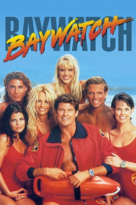
"The Baywatch logo is certainly one of the most recognizable from the 90s. But if you didn’t know the context behind the show, it could easily be interpreted as the title for a 1980s slasher horror flick. This is one of the funnier things about design in the 90s—it was sort of the beginning of when remixing older aesthetics with new ideas went into overdrive."
Baywatch Font
Get the Font


"The Are You Afraid of the Dark? logo is an interesting one. While it’s seemingly very simple with the oval and a clip art-like hand, the decision to use this particular typeface is slightly more sophisticated. Conceptually, though, it fits the show perfectly and has the right feel for the intended audience—especially with the ‘glow in the dark’ vibe it carries."
Benguiat Bold
Get the Font


"Beverly Hills 90210’s logo is certainly one of
the more considered and design-driven from the 90s—at least in terms of how it functions. Specifically, ‘Beverly Hills 90210’ is a long name for a TV show, and ‘90210’ just rolls off the tongue better—so the logic behind pulling the actual zip code forward while letting ‘Beverly Hills’ fall back in terms of visual hierarchy makes perfect sense."
Newhouse DT SuperCondensed Bold
Get the Font


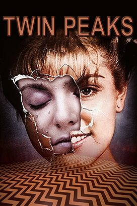
"As a TV show, Twin Peaks is anything but normal—and this logotype is the perfect fit for it. Particularly, it’s understated and has a mysterious strange glow to it—just like the show and the characters. Ultimately, it’s very David Lynch. You almost can’t imagine it being anything else—it wouldn’t work in a box or as a decorative. It’s just unexpected and perfectly gives off the vibe of
the show."
ITC Avant Garde Gothic Demi Condensed Std
Get the Font


"The Simpsons logotype is unmistakably Matt Groening—the creator of the show. It so perfectly fits the aesthetic of the animation that you could write almost anything in that style and it would instantly resonate as ‘Simpsons’. But beyond that, the combination of uppercase and lowercase letters sort of communicates the playful quality of the show. In many ways, it fits the show so well that it almost looks as if this is how Homer Simpson would sign the family name."
Simpsonfont by Sharkshock
Get the Font

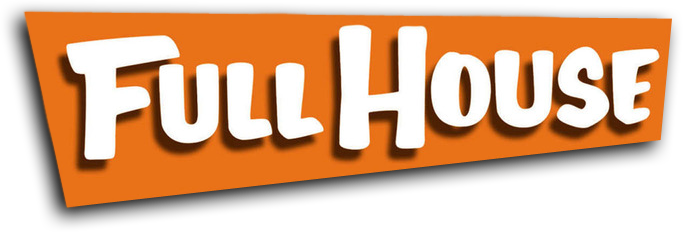
"The funny thing about the Full House logotype is that even though it looks very '80s, the aesthetic is actually rooted in the hand-painted signs that were common in the 1950s. And this makes sense, because the show has a wholesome, old-fashioned value to it. When it’s put in the context of more wild backgrounds and color combinations though, it sort of symbolizes the wackiness that happens within the plot scenarios."
Full House
by John Manjiro
Get the Font

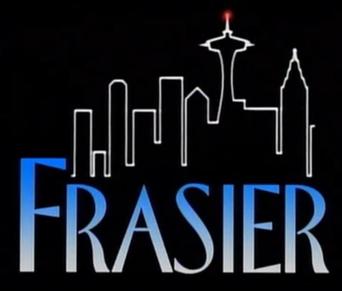
"In my opinion, the Frasier logo is probably one of the best to come out of 90s television. Like Seinfeld, it balances this seriousness and playfulness—a mood that perfectly embodies the premise of the show."
Florentine Regular
Get the Font
"The Seinfeld logo is now unmistakable and suits the show perfectly. It’s a really classy typeface but they made it italic to make it more playful. Creating it in red with the yellow oval—not to mention the triangle for dotting the ‘i’—perfectly balances the classiness and humor of the show’s plot."

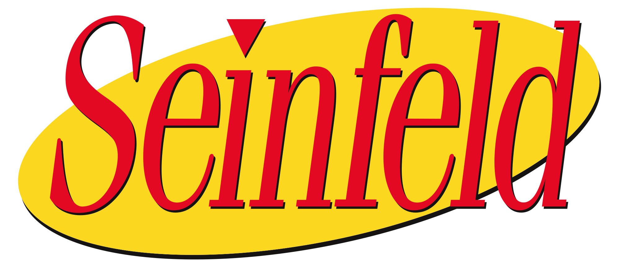
Gloucester MT Extra Condensed, italicized


"This is completely, unmistakably a '90s logo. With the rise of font creation software during this time, people started creating more artistic decorative fonts that strayed from classical form. This definitely comes from that place, but there is also logic behind it. For example, the large ‘F’ in ‘Buffy’ can be interpreted as a stake."
Get the Font
Buffied by GemFonts
"To me, the Law & Order logo is one of the more effective logos of the 1990s—and still today. First of all, you can’t see it without hearing the legendary ‘dun-dun’ in the back of your head. But aesthetically, it’s very much rooted in that unmistakable classic law firm aesthetic. What’s also interesting is their use of red and blue shadows-as if they each represent two sides of the law or the courtroom."


Get the Font
Friz Quadrata
Std Roman


"The hand-drawn aesthetic started to become really popular in the 90s and the Friends logo is a perfect example—but perhaps what’s more interesting is the logic behind it. Each of the colored dots between the seven letters can each be thought of as the different ‘friends’ within the show."
Get the Font
Gabriel Weiss'
Friends Font






tweet

share

Share


The Famous Fonts of Your Favorite '90s TV Shows
sign up for our newsletter


You’ll love our breakdown of Seinfeld SCripts.
Click to check it out.
Like this?
tweet

share

Share

tweet

share

Share

Get more fresh interactive stories delivered to your inbox weekly.


You’ll love our breakdown of Seinfeld SCripts.
Click to check it out.
Like this?


Gabriel Weiss'
Friends Font
"The hand-drawn aesthetic started to become really popular in the 90s and the Friends logo is a perfect example—but perhaps what’s more interesting is the logic behind it. Each of the colored dots between the seven letters can each be thought of as the different ‘friends’ within the show."


Friz Quadrata
Std Roman

"To me, the Law & Order logo is one of the more effective logos of the 1990s—and still today. First of all, you can’t see it without hearing the legendary ‘dun-dun’ in the back of your head. But aesthetically, it’s very much rooted in that unmistakable classic law firm aesthetic. What’s also interesting is their use of red and blue shadows-as if they each represent two sides of the law or the courtroom."


Buffied
by GemFonts

"This is completely, unmistakably a
90s logo. With the rise of font creation software during this time, people started creating more artistic decorative fonts that strayed from classical form. This definitely comes from that place, but there is also logic behind it. For example, the large ‘F’ in ‘Buffy’ can be interpreted as a stake."
Gloucester MT Extra Condensed, italicized


"The Seinfeld logo is now unmistakable and suits the show perfectly. It’s a really classy typeface but they made it italic to make it more playful. Creating it in red with the yellow oval—not to mention the triangle for dotting the ‘i’—perfectly balances the classiness and humor of the show’s plot."
Florentine Regular

"In my opinion, the Frasier logo is probably one of the best to come out of '90s television. Like Seinfeld, it balances this seriousness and playfulness—a mood that perfectly embodies the premise of the show."

Full House
by John Manjiro

"The funny thing about the Full House logotype is that even though it looks very 80s, the aesthetic is actually rooted in the hand-painted signs that were common in the 1950s. And this makes sense, because the show has a wholesome, old-fashioned value to it. When it’s put in the context
of more wild backgrounds and color combinations though, it sort of symbolizes the wackiness that happens within the plot scenarios."


Simpsonfont
by Sharkshock
"The Simpsons logotype is unmistakably Matt Groening—the creator of the show. It so perfectly fits the aesthetic of the animation that you could write almost anything in that style and it would instantly resonate as ‘Simpsons’. But beyond that, the combination of uppercase and lowercase letters sort of communicates the playful quality of the show. In many ways, it fits the show so well that it almost looks as if this is how Homer Simpson would sign the family name."


ITC Avant Garde Gothic Demi Condensed Std
"As a TV show, Twin Peaks is anything but normal—and this logotype is the perfect fit for it. Particularly, it’s understated and has a mysterious strange glow to it—just like the show and the characters. Ultimately, it’s very David Lynch. You almost can’t imagine it being anything else—it wouldn’t work in a box or as a decorative. It’s just unexpected and perfectly gives off the vibe of the show."


Newhouse DT SuperCondensed Bold
"Beverly Hills 90210’s logo is certainly one of the more considered and design-driven from the 90s—at least in terms of how it functions. Specifically, ‘Beverly Hills 90210’ is a long name for a TV show, and ‘90210’ just rolls off the tongue better—so the logic behind pulling the actual zip code forward while letting ‘Beverly Hills’ fall back in terms of visual hierarchy makes perfect sense."

Benguiat Bold

"The Are You Afraid of the Dark? logo is an interesting one. While it’s seemingly very simple with the oval and a clip art-like hand, the decision to use this particular typeface is slightly more sophisticated. Conceptually, though, it fits the show perfectly and has the right feel for the intended audience—especially with the ‘glow in the dark’ vibe it carries."

Baywatch Font

"The Baywatch logo is certainly one of the most recognizable from the 90s. But if you didn’t know the context behind the show, it could easily be interpreted as the title for a 1980s slasher horror flick. This is one of the funnier things about design in the 90s—it was sort of the beginning of when remixing older aesthetics with new ideas went into overdrive."


Handmade
graffitti effect
"From both an aesthetic and a logical point of view, The Fresh Prince of Bel-Air logo is very well done. Of course, you get that urban kid graffiti vibe from Will Smith’s character, but what makes it interesting is that the rest of the type looks like it came from a Bel-Air country club. So while the classic Bel-Air type is conservative and classy, ‘Fresh Prince’ comes into this community big, loud, and with a colorful personality—just like the premise of the show."


Fontageous Rendition
"Like the Friends logo, Dawson’s Creek really rides that 90s handwritten type trend. In the case of Dawson’s Creek, however, it almost feels more like a handwritten love letter or a note getting passed between people in a high school classroom. The mood and tone perfectly fits the overall feel of the show and target audience."


Bookman Italic
"While the 90s had a convergence of different styles, the Family Matters logo is a good example of how some middle class family-based shows wanted to have a more classic traditional feel. It’s as if you can imagine this type being used to engrave the family’s name on their mailbox."


x-files
"The X-Files is perhaps one of the more seriously-designed logos of the 1990s. It just connects so well with what you imagine to be sci-fi; it has this Twin Peaks-like understated mystique to it. It’s got a high-tech sexy feel to it but also very much official. It perfectly embodies the idea behind the show."


Rugrats by
Jayde Garrow
"Like The Simpsons, the Rugrats logo has that same loose handwritten quality that feels like it could have been written by a character in the show. If you can imagine, it’s almost like one of the characters wrote it in play-doh. Combined with the ‘Kapow’-like blast effect commonly seen in comic books, the 3D effect really pronounces their personalities and the wacky adventures they go on."

The Famous Fonts of Your Favorite '90s TV Shows
With the rise of digital design tools in the late 1980s and early 1990s, "old guard" design rules were torn down and gave way to new ways of thinking about graphic design. As a result, many new graphic styles were created and came to define an era rooted in remixing and experimentation. One of the best examples of this is in the form of logos for '90s-era TV shows.
Typography expert Alexander Tochilovsky, Design Curator of the Herb Lubalin Study Center of Design and Typography in New York City, understands the logic behind these logo designs more than most. Here, he breaks down what he thinks of some of the most iconic TV show logos from this era.
tweet

share

Share
