BRAND GUIDE
June 2025
Welcome to the GTT brand guide
We operate in a highly competitive sector characterized by daily change and disruption. To increase our brand awareness and demand for our services both online and offline, we must stand out. Evolving our brand identity helps us design for maximum impact to cut through, extend our reach and better serve our customers in today’s always-on world. This document is a reference to be used internally and with external partners who represent or support GTT in going to market. It aims to align all GTT colleagues to understand who we are and what we stand for, in addition to consistency in brand application across all marketing, sales and communications materials. By following this guide, our brand can stay true to the creative principles that make us unique and support our mission for driving Greater Technology Together.
For any questions, please contact: marketing@gtt.net
Introduction
Our company
Our foundation
Our values
Tone of voice
Our story
Our proposition
Our technology
Logo
Typography
Color palette
Visual elements
Photography
Iconography
Diagrams
Design examples
VISUAL IDENTITY
SHARING OUR STORY
Brand Fundamentals
01.
02.
03.
01. BRAND FUNDAMENTALS
The building blocks of our brand
Together, we’re ready to take them on that journey.
To succeed, they need a true partner that’s willing and able, to transform their entire networking, security and cloud compute experiences.
Being a ‘typical’ technology provider no longer meets the needs and aspirations of our customers.
GTT is purpose built to deliver networking-as-a-service for distributed enterprises, on a global scale. Trusted by the world's largest organizations for over 20 years, GTT brings together the right people, partners and technology, to reduce the burden on IT teams and solve the most pressing network connectivity and security challenges. Built on a Tier 1 global network, the GTT Envision platform provides visibility, insights, orchestration and control enabling customers to achieve business missions and meet ongoing demand. Founded in 1998 in Virginia, US, GTT has annual revenues of $1bn. It has close to 2,200 global employees and over 7,500 customers worldwide.
OUR COMPANY
Focusing on transforming industries, On creating impact, On building reputations.
Our customers succeed by thinking bigger than technology.
To reduce the burden of technology – allowing organizations to focus on their bigger picture.
OUR BRAND FOUNDATION
PURPOSE
VISION
MISSION
Why we exist
To create better, more streamlined, networking experiences.
What we will achieve
Simply and securely connecting people and machines to data and applications, anywhere in the world. Delivered by one partner, with one platform and one digital experience.
How we get there
Too often technology is sold off-the-shelf, under-supported and under-optimized. We believe in a different approach. We tailor our leading technology to solve customer problems, meet strategic objectives and achieve more effective outcomes. Aligning employees, partners and technology behind a common customer mission. Always building. Always delivering. Always evolving. Together. We take away the burden of technology, leaving customers to focus on their bigger picture. Providing a more accessible, more useable, more effective and more resilient experience.
Brand Values
We are GTT. we believe in accelerating Greater Technology Together.
We are market-leading technologists. Possessing unique patents. With a focus on delivering, implementing and streamlining networking solutions, underpinning the most advanced corporate missions.
We partner, we support and we elevate our customers. It is not a ‘provider’ relationship. We are partners for the journey – overcoming challenges and experiencing successes together.
Greater Technology Together
OUR VALUES
WE ARE CURIOUS
We listen and question carefully to fully understand the challenge before proposing a solution We seek to improve by learning new skills and proactively helping customers and colleagues to succeed Our people are encouraged to challenge the status quo in the spirit of continuous improvement
WE ARE CONSISTENT
Our customers can rely on us to deliver the technology, expertiseand security they need to grow their business From design to delivery, we set expectations, communicate progressand fulfill our promise We prioritize repeatable efficiency and rigor to achieve operational excellence
WE ARE COLLABORATIVE
We draw on experience from across the business to solve problems as a team We’re always ready to adapt as and when circumstances change We listen, solve and build long-term relationships
WE ARE COMMITTED
We’re united around a common goal – being a customer-centric, disciplined and focused business We take ownership and always see projects through to completion We go above and beyond to exceed expectations
BRAND FUNDAMENTALS
| #
OUR TONE OF VOICE
Consistency in the way that we speak is essential for building a strong, cohesive and effective brand presence. Here, we outline the language style, tone and personality traits that we should use across all forms of communication. Depending on the audience or topic, how we communicate as a brand can vary. But fundamentally, there are four tonal qualities to consider when writing.
AUTHORITY ENERGY PERSONALITY CLARITY
We write with:
An authoritative tone of voice helps establish us as a knowledgeable and trustworthy voice within our industry. Why does this suit us? Our individual and collective experience makes us experts in our field. And we are leading the industry in a new direction. As a result, we speak with confidence, but never arrogance. We solve challenges. Drawing on real-life deployment experience – with the lessons learned and the success stories to prove it. What does it mean in practice? Write with confidence. Support claims with credible sources and data. This helps us build trust and credibility. Where appropriate, use real-life examples of existing and previous projects. We want our audience to know that what we say comes from a place of personal and collective experience. Our brand uses real-life photography that demonstrates the real-life problems we solve. To set ourselves apart, it’s essential that our identity is unique. We need to steer clear of the overused visual styles common in the B2B tech industry. Our approach connects streamlined technology with the human value of togetherness to effectively convey our narrative and vision.
WITH AUTHORITY,
We design and deliver complex solutions. But that doesn’t mean that the way that we talk about them shouldn’t be easy to understand. In fact, it’s crucial that we keep things straightforward, unambiguous and accessible. Why does this suit us? Simplification is a key part of our proposition. Our language has to follow suit. We understand that not everyone has depth of experience. And as we reshape perceptions and industry norms, we must guide people through the journey. This can only be achieved if we’re clear, concise and easy to understand. What does it mean in practice? Cut the waffle, the buzzwords and the clichés. Instead, we break down challenging concepts, so they are easily digestible. Embracing brevity challenges us to find the right words. With the GTT Envision Platform at the heart of our business, the use of sharp and blurred effects create opportunities for visualizing the interplay between what can and can’t be seen and the value of visibility that our platform brings to our customers.
AND WITH CLARITY
A personable tone of voice makes communications feel more human and approachable. As a result, it helps enhance the connection with our audience – and cut through industry stereotypes. Why does this suit us? We’re not a typical provider. We are driving change. Acting as true partners for the life of our customers’ evolving networks. Our partnerships are built on strong, trusted, human relationships. The way that we speak should be consistent with this. What does it mean in practice? Don't get bogged down in jargon, regardless of how deep or technical the subject matter. Show some personality. Speak like people, not robots. Avoid the over-complex. The subjects in our people-based photography resonate with “Greater Technology Together”, showing a diverse range of professional people interacting with each other and with technology, making the link between the fabric of everyday working life and the support our platform provides.
WITH PERSONALITY,
An energized tone of voice is lively, enthusiastic and dynamic. It helps us capture and hold the attention of our audience. Why does this suit us? We love what we do, we shouldn’t hide that. It’s one of the reasons we excel at it. By sharing that excitement, we help inspire confidence across our audiences. Enthusiasm can be infectious – we want our audiences to be as optimistic about the future as we are. What does it mean in practice? Use bright, active language. Be positive, even when discussing challenges. Don’t be afraid to create bounce and rhythm in written communications. Be encouraging and warm, even when delivering technical content. Frame solutions and activities in a way that elevates us. Our chosen colors are bold and purposeful, reflecting the energy, innovation, and forward-thinking nature of our brand. Each hue is carefully selected to inspire confidence, creating a dynamic visual experience that resonates with our audience.
WITH ENERGY...
02. SHARING OUR STORY
How we articulate what we do
ONE GLOBAL PLATFORM. ONE NETWORKING EXPERIENCE.
GTT simply and securely connects people and machines to data and applications – anywhere in the world.
articulating our proposition
GTT powers a more streamlined cloud networking experience. Simply and securely connecting your people and machines to data and applications – anywhere in the world. One global technology platform to connect, orchestrate, virtualize and automate your network. One digital experience to visualize, manage and adapt every aspect. All through a single partner, to support you whenever, wherever and however you need it. It’s time for secure cloud networking as you’ve never experienced it. GTT. Greater Technology Together.
Medium length
Managing a global network is inherently complex. More data. More devices. More places, people and applications to connect. Creating more security vulnarabilities at every stage. Achieving secure, reliable connectivity requires an ever-increasing range of technologies, a growing supplier-list and greater management responsibilities. Or does it? GTT is changing the way distributed enterprises approach networking. GTT is a leading networking and security as a service provider for multinational organizations, simply and securely connecting people and machines to data and applications – anywhere in the world. Providing one global technology platform to connect, orchestrate, virtualize and automate your network. One digital experience to visualize, manage and adapt every element. Through a single partner, to support you whenever, wherever and however you need it. It’s time to take back control. It’s time to envision a new era of networking-as-a-service. GTT. Greater Technology Together.
Longer version
A GLOBAL PLATFORM FOR NETWORKING AND SECURITY AS A SERVICE
A single, multi-service technology platform to connect, orchestrate, virtualize and automate every aspect of your global infrastructure.
THE TECHNOLOGY
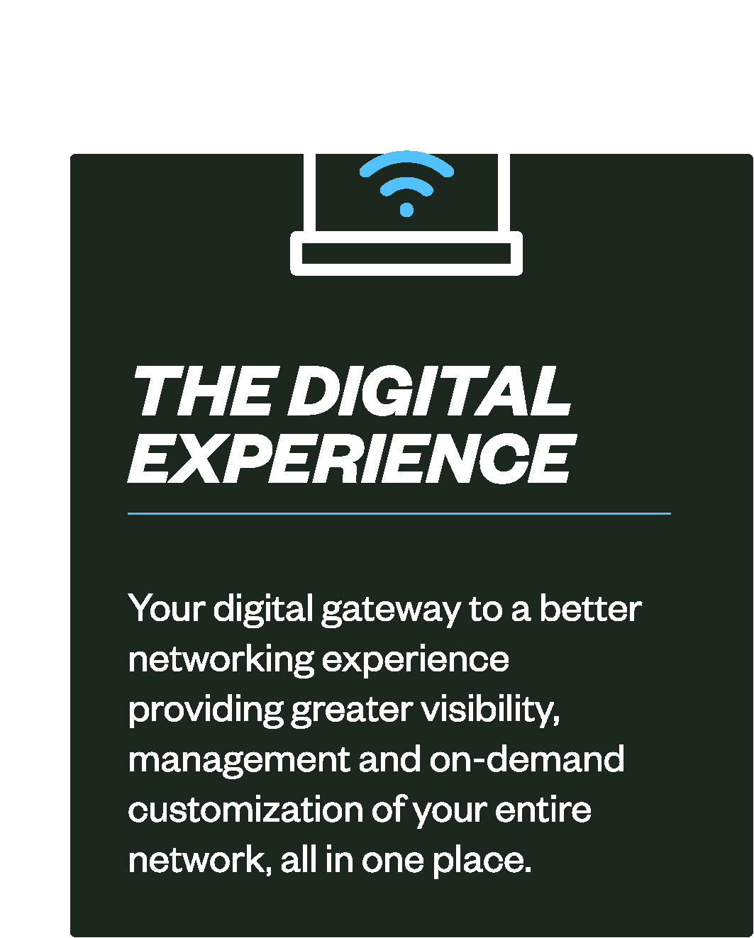
THE DIGITAL EXPERIENCE
Your digital gateway to a better networking experience providing greater visibility, management and on-demand customization of your entire network, all in one place.
THE PEOPLE & EXPERTISE
Bringing your network to life with professional, managed and technical services, to support you whenever, wherever and however you need.
Defining the components of our technology
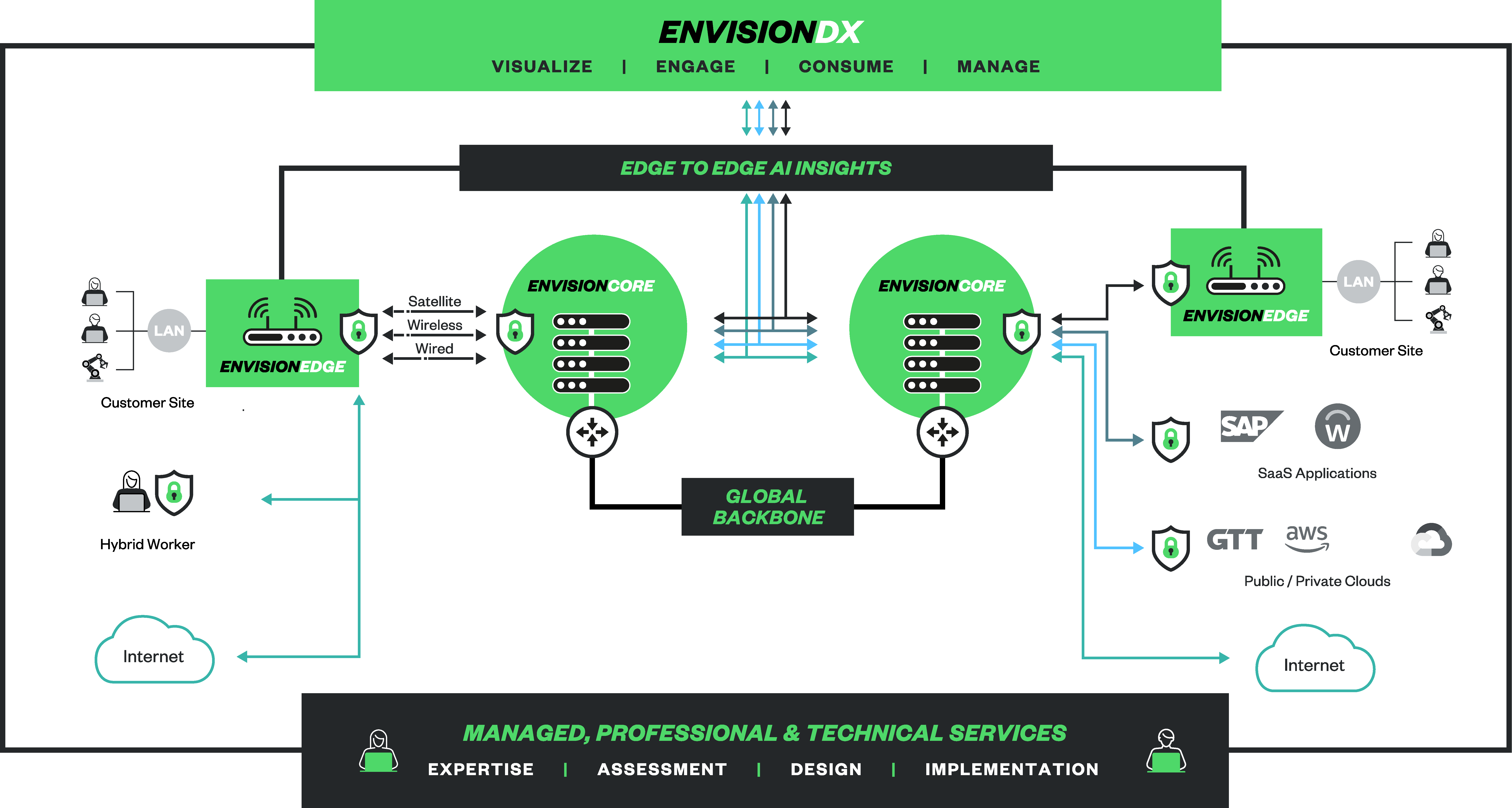
A single, multi-service technology platform to connect, orchestrate, secure and automate every aspect of your global infrastructure – from Edge to Core.
Greater visibility and insights than ever before. More ability to manage, customize and control every aspect of your network. All made possible by GTT EnvisionDX
VISUALIZE
Deploy, observe and automate multiple virtualized functions directly to your premises and people. Simplify your site infrastructure with a single device for managed networking, secure service edge (SSE), local compute and routing Deploy new service-chained edge capabilities in near real-time as your site requirements evolve Aggregate wired, wireless and satellite access connectivity Observe the performance of your network devices and connections crucial for business goals
Orchestrate your virtualized network functions from the GTT EnvisionCORE, across global locations, to your premises and people. Access your choice of scalable connectivity and security infrastructure deeply integrated into the GTT Tier 1 global backbone Rapidly connect directly and securely to cloud service providers across the globe On demand delivery, configuration and management of networking, security and hosted compute functions
Our industry-leading, Tier 1 IP backbone enables you to securely reach over 170 countries, across 6 continents. 75% of customers' traffic originates and terminates on the GTT network vs. public internet, delivering better performance and protection Seamless delivery of bandwidth-heavy traffic Application-aware routing for agility to maintain high performance as users, locations and applications change No more than one hop away from your data with 2,300 interconnects
Single pane, complete visibility See the most relevant data across your network and security environment in a single, GTT-curated view.
Interact on your terms Connect to your networkand our teams, in the way that suits you. Online, with APIs or omnichannel messaging – you’re in control.
ENGAGE
Customize your network services, on demand Scale up or down. Add or remove services. And customize every aspect of your network, security and cloud provision.
CONSUME
From billing to access Allow greater control for every team, with customizable environments to simply manage finances, functions and features across all your sites.
MANAGE
PROMOTING OUR PEOPLE AND EXPERTISE
From onboarding to orchestration and beyond Get direct access to a local team. With a consultative pathway, we help guide, design, evolve and optimize across the lifecycle of your network.
ACCOUNT SUPPORT
Solving your network challenges Project, program or incident management, from expert technologists – you choose the additional services needed to optimize your network or augment your team.
PROFESSIONAL SERVICES
Reducing the burden on your teams From full management of your network to specific support in key areas, you get the peace of mind to stay focused on your bigger picture.
MANAGED SERVICES
Brand Proposition Pillars
KEY TERMINOLOGY AND WRITING STYLES
General Guidance
Abbreviations and acronyms Spell out on the first reference with the acronym in parentheses if you'll use it again (e.g. Secure Access Service Edge (SASE). After that, just use the acronym. Percentages Use the % sign with a numeral (e.g. 50%). Commas Use them naturally, as you would when speaking. We do NOT use Oxford commas (commas used before "and"). Periods Use a single space after a period at the end of a sentence. Capitalization Capitalize proper nouns and key words in titles. Use sentence case for headlines when no brand styling is applied. Spelling We use US English dictionary spellings across all of our English-speaking content.
CONNECT
Connecting people, clouds, data centers and sites globally, with fiber, wireless or satellite technologies. Reach more locations, premises and people through a single global network. Choose the most appropriate access for any use case, in any market. Benefit from a single provider’s economies of scale and access partners. Easily add, manage and adapt locations or functions via a self-serve interface.
Enabling and optimizing business connectivity, where and when you need it
SIMPLIFY
SECURE
Simplifying complexity across infrastructure & initiatives
Ensuring network security & protection, across all environments
Securing your networks and clouds, against a rapidly evolving risk landscape, with the right combination of people and technology. Access to high quality security engineers without the need to hire. Benefit from our experience managing 1,000s of networks and broad view of the evolving threat landscape. Maintain the majority of traffic on a single network. Best of breed security technologies, in a single integrated platform.
Simplifying every aspect of your security and network assessment, deployment, management and growth – with one accountable partner. Flexible engagement model, to support or supplement your teams as you need. Consolidate infrastructure to streamline project delivery, management and timelines. Consistent digital experiences for all users, across all teams. One bill - One project plan - One consistent partner experience.
our END-TO-END SOLUTIONS
SPECIFICs
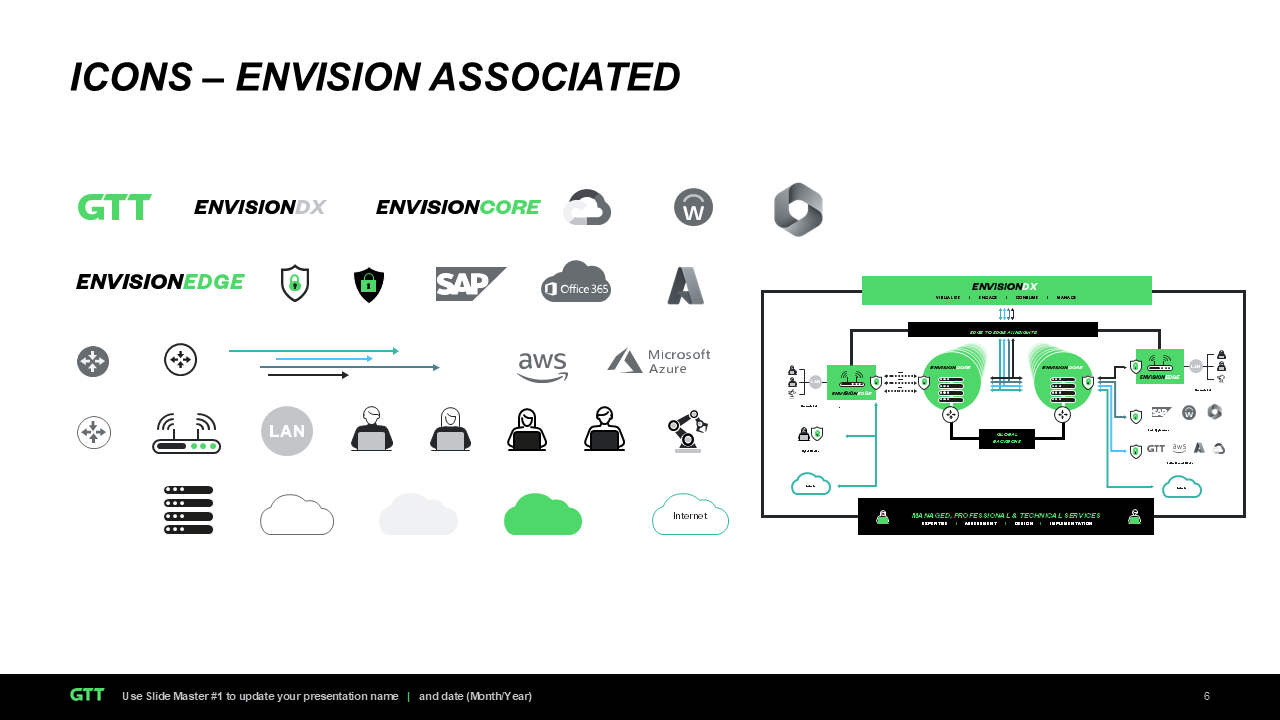
Customers, clients and partners We refer to the people that buy our services as customers, not clients. We partner with our customers as partners, but also have a range of technology partners that help us deliver our network capabilities. Envision platform components Where design can be added (in marketing materials or PPT, for example) we use capitalized text in headings (with color but no spacing). When writing in body copy we use title case for ‘GTT Envision’ and capitalize the component name. This appears as GTT EnvisionEDGE or GTT EnvisionDX or GTT EnvisionCORE.
Functionally articulating who we are
Sentence opening, suitable for describing GTT as part of a sentence, e.g. when beginning a press release. GTT, a leading networking and security as a service provider for multinational organizations, has announced.... One line (max. 160 characters incl. spaces, suitable for when only one sentence is needed e.g. flyers or X). GTT is a leading networking and security as a service provider for multinational organizations, connecting people and machines to data, and applications – anywhere in the world. Short form (max. 250 characters, suitable for limited space descriptions, such as brochures, Facebook, etc.) GTT is a leading networking and security as a service provider for multinational organizations, connecting people and machines to data, and applications – anywhere in the world. We connect. We secure. We simplify.
Long form (Suitable for press releases, LinkedIn, places with space for longer descriptions). About GTT GTT is a leading networking and security as a service provider for multinational organizations, connecting people and machines to data and applications – anywhere in the world. We serve thousands of organizations, bringing together the right people, partners and technology to reduce the burden on IT teams and solve the most pressing networking and security challenges. Built on our top-ranked global Tier 1 network, the GTT Envision platform provides visibility, insights, orchestration and control, enabling customers with consumable solutions to achieve business missions and meet ongoing demand when, where and how needed. Our portfolio includes SASE, SD-WAN, security, internet, voice and other connectivity options, complemented by a suite of professional services and exceptional sales and support teams in local markets around the globe. We partner with our customers to deliver Greater Technology Together. www.gtt.net.
03. VISUAL IDENTITY
Overview of design components
Building a design framework for the brand
Imagery
Color and texture
Layouts and Shapes
LOGO VARIATIONS
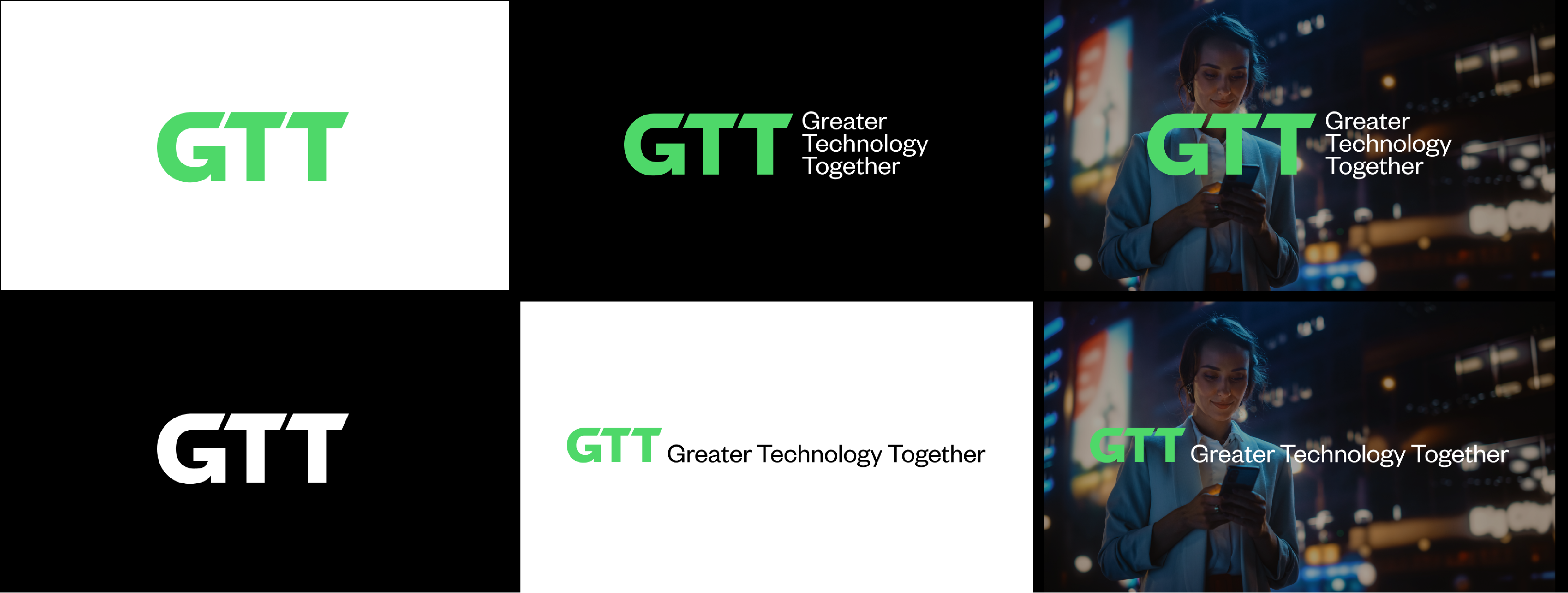
The black version can be used on white or GTT Green. The white version can be used on of a dark image and, when color isn't available, on black.
There are three versions of our logo but most of the time we will use the GTT Green version. It will mainly appear on black but can be used on white as long as visibility is ensured.
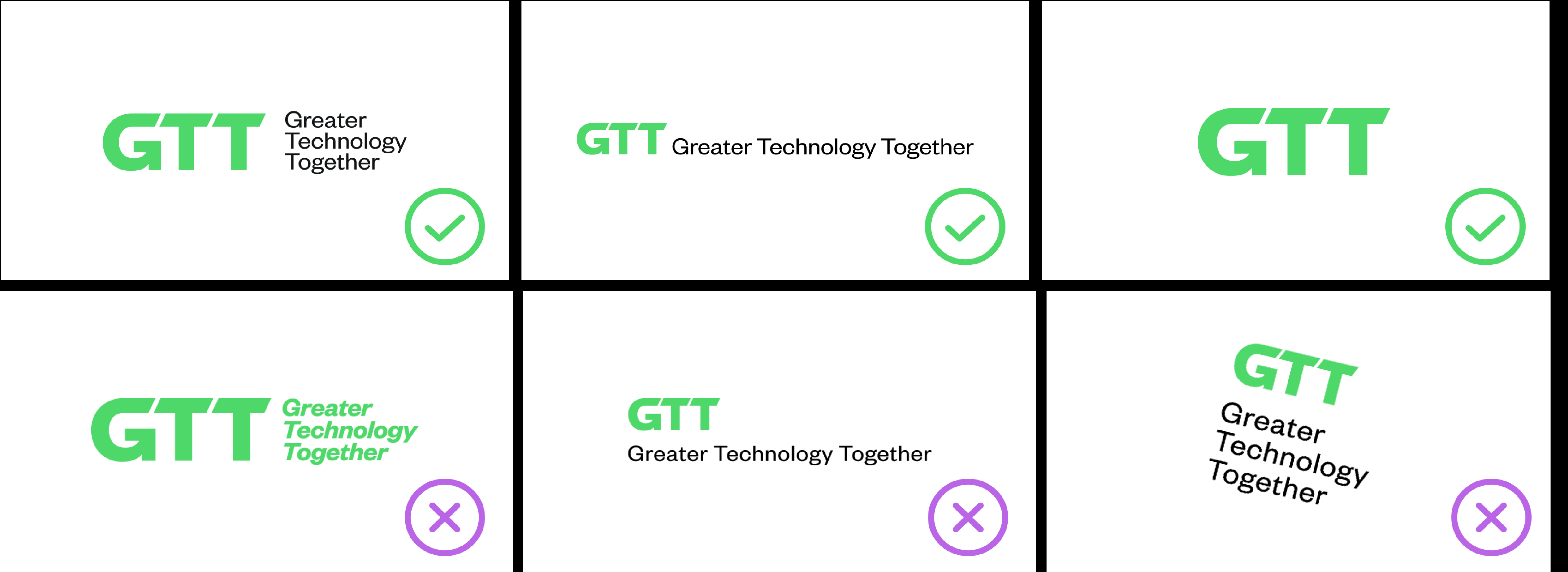
LOGO DO'S AND DON'TS
LOGO sizing and Clear space
The clear space on either side is equal to half the height of the logo. Use more when space allows (but given the extreme nature of some online banners, a little less might be needed – this is permitted as long as clarity of the logo is maintained given the format).
Our logo is simple, strong and unfussy. It hints at the dynamism in our organization with the angled edges and the upward arrow within the letter 'G'.
TEXT FORMATTING GUIDELINES
Headings: Use capitalized text for headings Maintain the color scheme consistent with the brand (e.g., GTT Green, white and secondary color) and avoid any additional spacing between GTTEnvision and CORE/DX/EDGE Example: GTTENVISIONEDGE or GTTENVISIONDX Body Copy: In body text, write “GTTEnvision” in title case, capitalizing the component name.I n body copy, do not use colours. Words shouldbe the same colour as body copy. Example: GTTEnvisionEDGE or GTTEnvisionDX Logo Usage: For branding consistency, utilize the official Envision logo when presenting marketing materials or PowerPoint presentations. Additionally, apply a secondary color for the component names to distinguish between them, providing clear visual guidance for users. This approach not only enhances brand recognition but also helps users quickly identify and differentiate the various Envision components.
This guidance applies to Marketing assets. It does not apply to long-form or text-heavy format such as press releases, articles, blogs, etc.
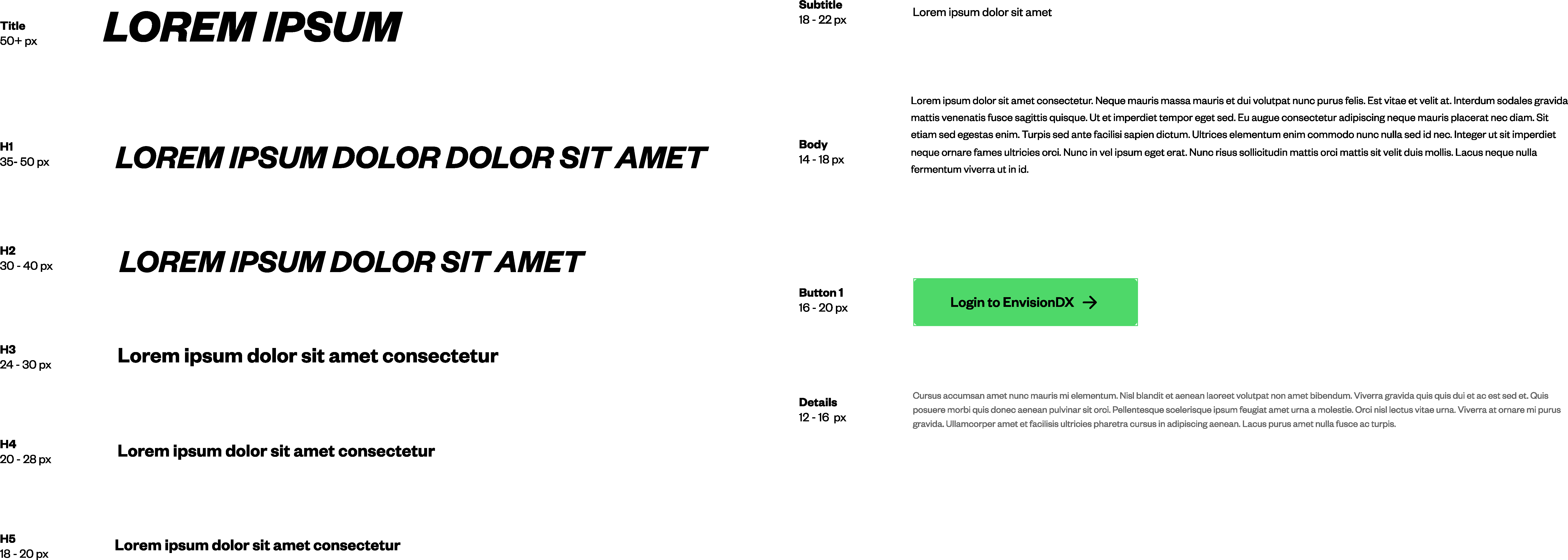
FOUNDERS GROTESK
TYPOGRAPHY
We have a progressive approach to leading where, as the copy gets larger, the space between the lines is adjusted to maintain a similar visual feel. When copy is smaller it needs more leading for legibility than when it is large. Generally we alter the leading through a range from 85% of the type point size to 77%. This is a guide and different length lines might need extra finessing to get the optimal appearance.
Founders Grotesk Bold Italic is used for headings, sub-headings and feature copy in all UPPERCASE. Founders Grotesk is used in three weights, Regular, Medium and Semibold. Italic versions of these weights are available if needed. These two fonts are used for all body text and captions.
You can purchase the fonts from klim.co.nz
Founders Grotesk Bold Italic
Heading
Founders Grotesk Regular
Body copy
Founders Grotesk Medium
Founders Grotesk Semibold
LOREM IPSUM DOLOR SIT AME
Headline
Subheading
Lorem ipsum dolor sit ame
Lorem ipsum dolor sit amet, consectetur adipiscing elit. Ut euismod, leo quis facilisis pulvinar, orci tellus placerat felis, ut congue lectus libero a lectus. Praesent at faucibus mi, ut condimentum erat. Integer at sem bibendum, sodales justo quis, pretium mauris. Lorem ipsum dolor sit amet, consectetur adipiscing elit. Ut euismod, leo quis facilisis pulvinar, orci tellus placerat felis, ut congue lectus libero a lectus. Praesent at faucibus mi, ut condimentum erat. Integer at sem bibendum, sodales justo quis, pretium mauris.
Heading Type Specification
Case Upper case only Tracking +10 Solid Leading 77%-88% of point size Kerning Optical
Body Copy Type Specification
Case Sentence case Tracking 0 Leading 125% of point size at body copy size 100% of point size if very large Kerning Optical
WEB TYPOGRAPHY
TYPOGRAPHY ALTERNATIVE
We substitute Arial for Founders Grotesk on all Microsoft Office documents – PowerPoint, Word, Excel, etc. Arial comes standard on all PCs. For documents that are to be used by teams across the business, for example PowerPoint slides or Word documents, we use Arial as a safe font instead. We use Arial Black Italic for headings. Subheadings and body copy utilise the standard Arial font pack.
TYPOGRAPHY EXAMPLES
By combining regular and italic typography with a color palette of black, white, GTT Green and secondary colors, we achieve a cohesive and recognizable brand identity while maintaining flexibility in design. This approach allows for the creation of engaging layouts with eye-catching taglines that stand out, all while keeping the design clean and uncluttered. The result is a visually appealing and versatile style that supports brand consistency without sacrificing creativity. Secondary colors should be used strategically across visual assets to enhance emphasis and support text hierarchy without overwhelming the design.
Login to GTTEnvisionDX >
CORE COLOR PALETTE
For typography, use two font colors (ex black and GTT Green) to highlight key information, making the content easier to navigate and ensuring that important details stand out effectively. We do not use tints of GTT Green.
GTT Green, black and white is a key feature of our brand recognition and should be always present across all visuals. When designing, always consider starting with black as the background. It serves as a strong backdrop that enhances the visibility of our logo and messaging. However, if the design involves a large amount of text, using white may be more appropriate to improve readability.
SECONDARY COLOR PALETTE
Secondary colors should be used strategically across visual assets to enhance emphasis and support text hierarchy without overwhelming the design. To maintain clarity, only one secondary color should be used in text. For icons and charts, however, multiple secondary colors can be applied to help differentiate information visually. The one exception to the rule is mentions of Envision and its components EnvisionCORE, EnvisionEDGE and EnvisionDX. Purple color only used for negative information.
Bold, sharp-edged and consistent with the brand look and feel, the linear style shapes are a nod to the “Greater Technology Together” new positioning. They symbolize clarity, direction and structure. Using the secondary color palette, we seamlessly blend shapes with the images to represent a tight partnership between technical and personal experience you can get from GTT. The choice of the color used is always determined by the color tones present in the image where it is applied. Shapes should only be used alongside images, positioned on one side to complement the visual and maintain brand consistency. Avoid using full frames around images; instead, opt for a single line. The size of the shape should always be proportional to the image, with the shape's length or width being half that of the image for a balanced and harmonious design.
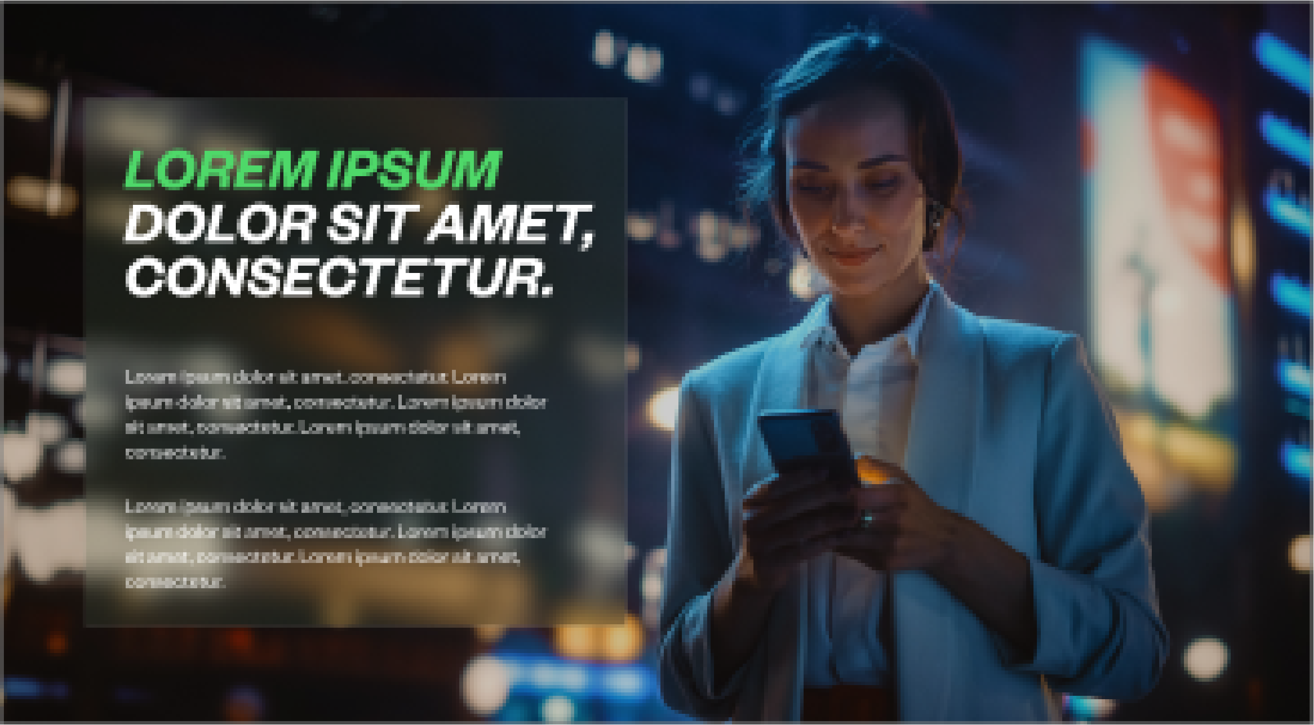
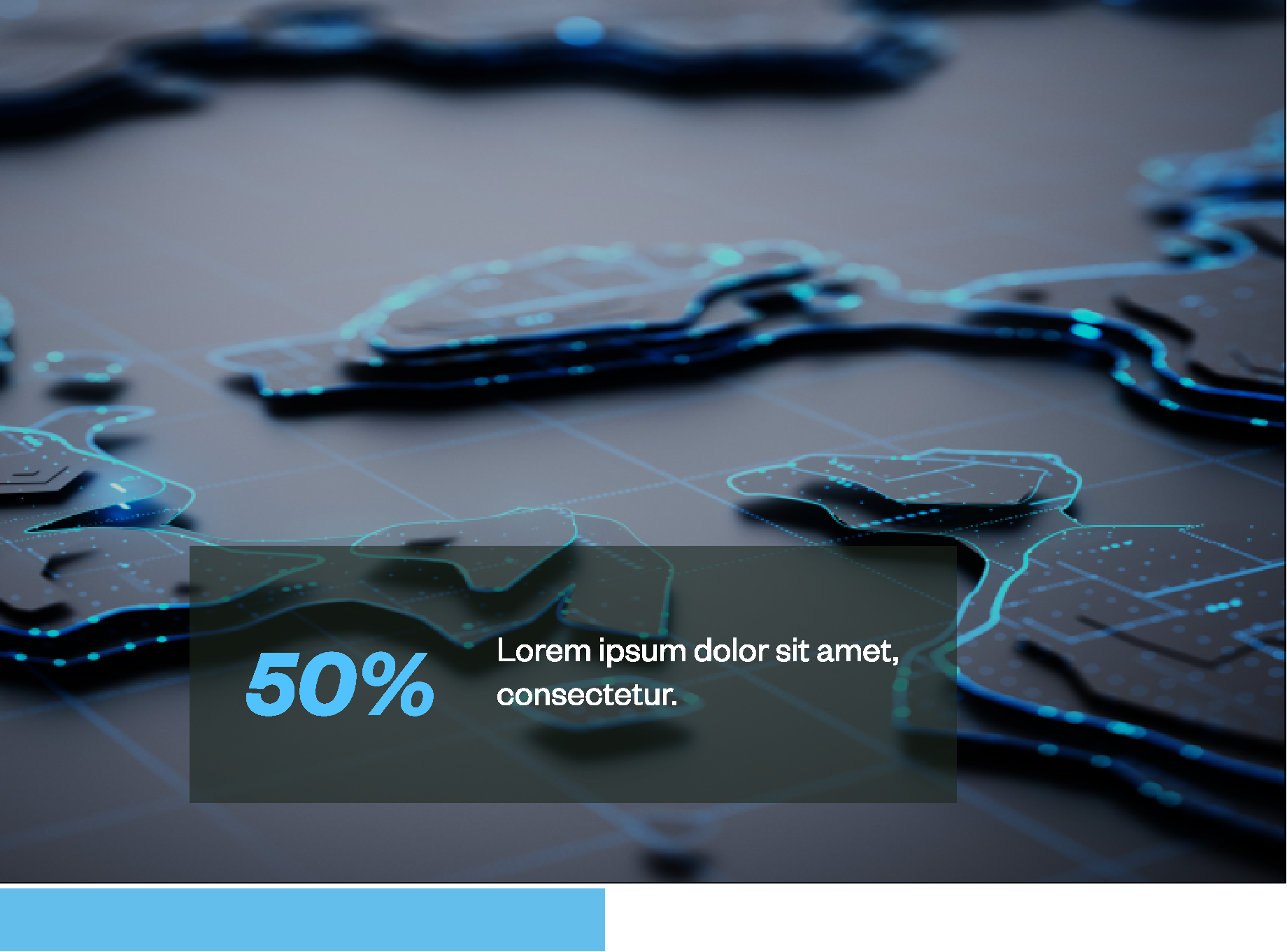
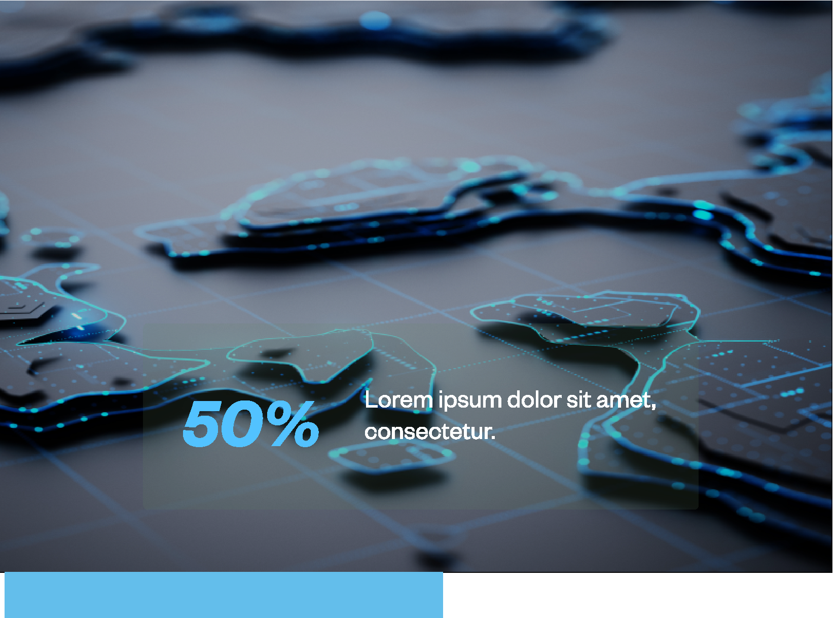
TEXT BOX OVERLAYS
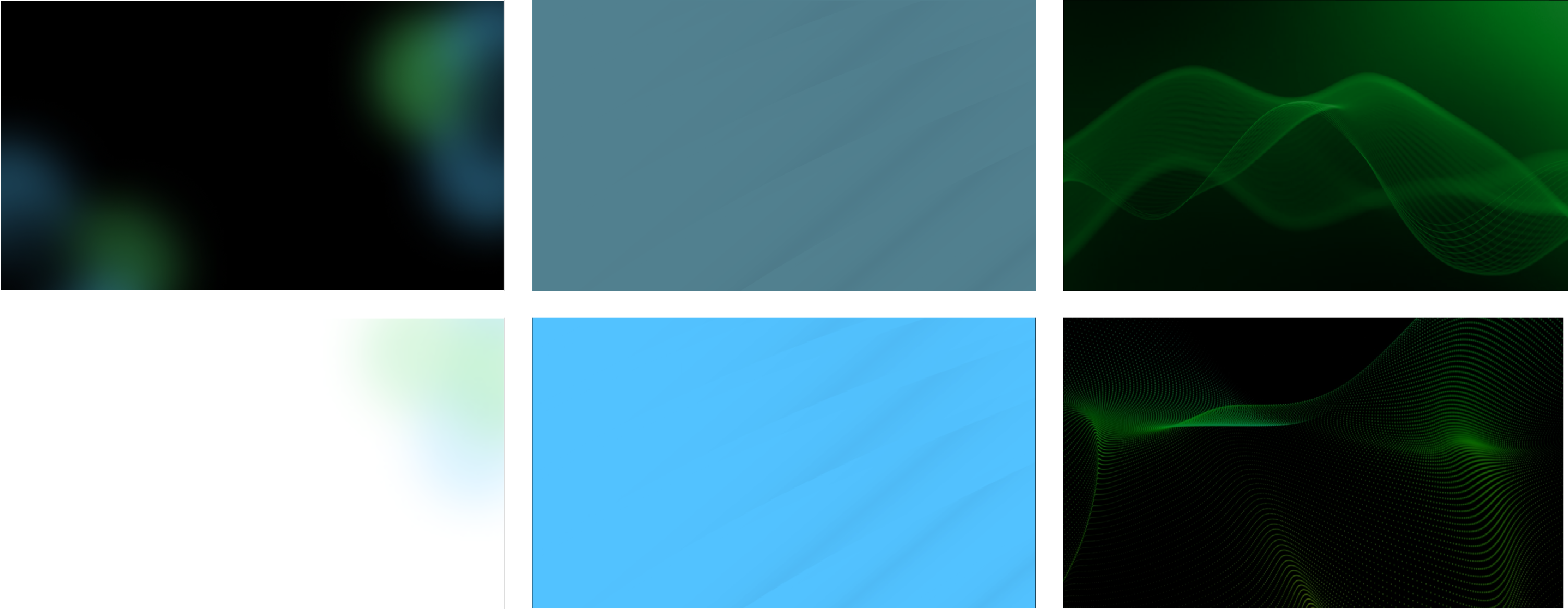
BACKGROUND IMAGERY
You can use iStock videos for the animated background. Carefully choose the video so it’s not too busy or has too much movement. You need to take text readability into consideration while choosing the background.
There are two main types of backgrounds: static and animated. These backgrounds are created to add depth to the design and help it stand out with pops of vibrant color. For web we have an option to use both animated and static backgrounds to enhance the experience. Animated background will add movement to website.
LINEAR SHAPES
Presentation/social backgrounds
Presentation dividers
Digital backgrounds for web
BLUR OVERLAYS
We add sophistication to the new visual style for GTT and expand its creative vision further by introducing the blur effect for the creative assets. It’s a smart, sophisticated and unique approach to highlight details while maintaining clarity and cohesion and provides a unique combination to show details. Blur effects can be applied across different visuals to create a background that enhances text legibility when placed over images. Blur boxes can also be used in designs to provide a clear visual structure for the text, ensuring it stands out effectively. The overlay effect serves the same purpose as the blur, providing a background that enhances text legibility, but it is primarily used in PowerPoint presentations or other designs where the blur function is not available (seen on the next page). Text box style will vary from print to digital/web. For use on the web, we will also incorporate a radius to soften the look and improve engagement.
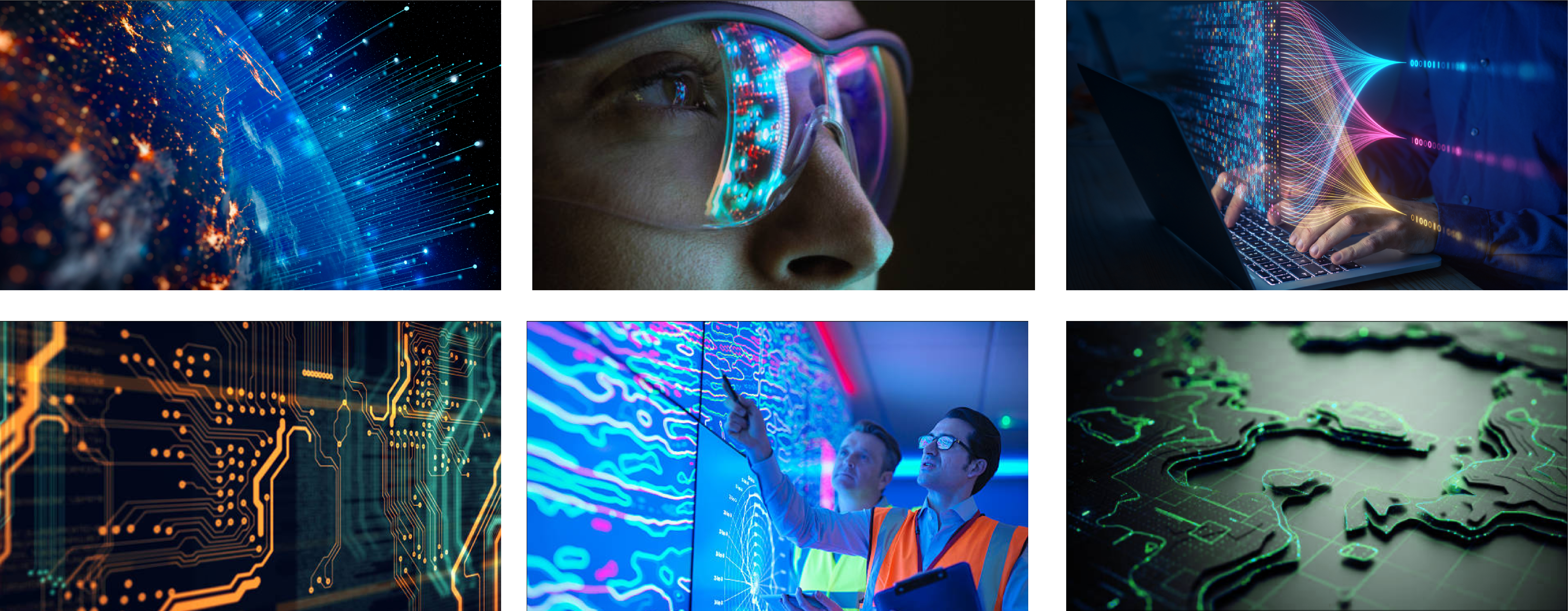
people and tech PHOTOGRAPHY
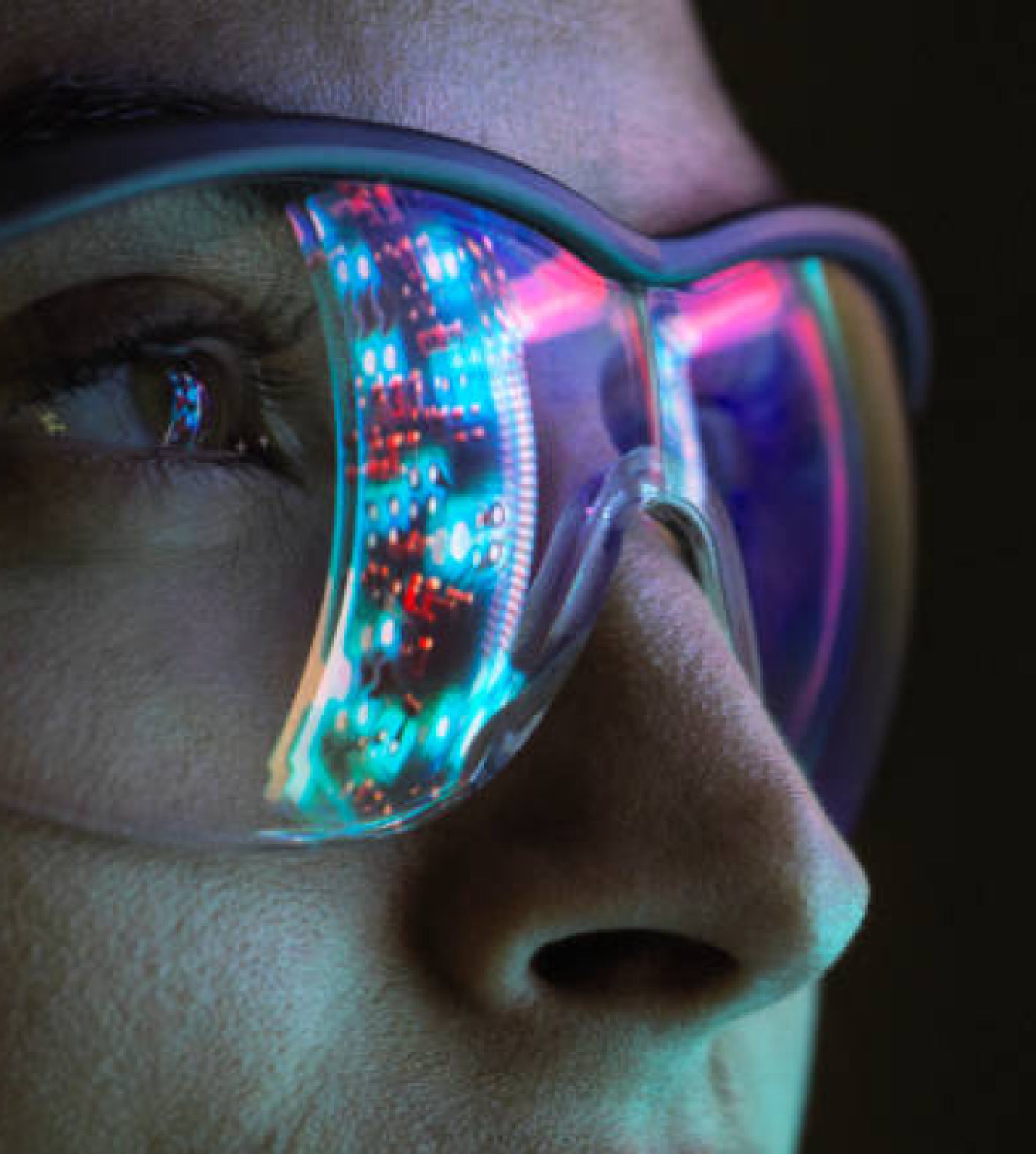
Future driven, method-focused imagery. It will show the technology we employ in action but also how we serve our customers and how our processes help them adapt, grow and succeed.
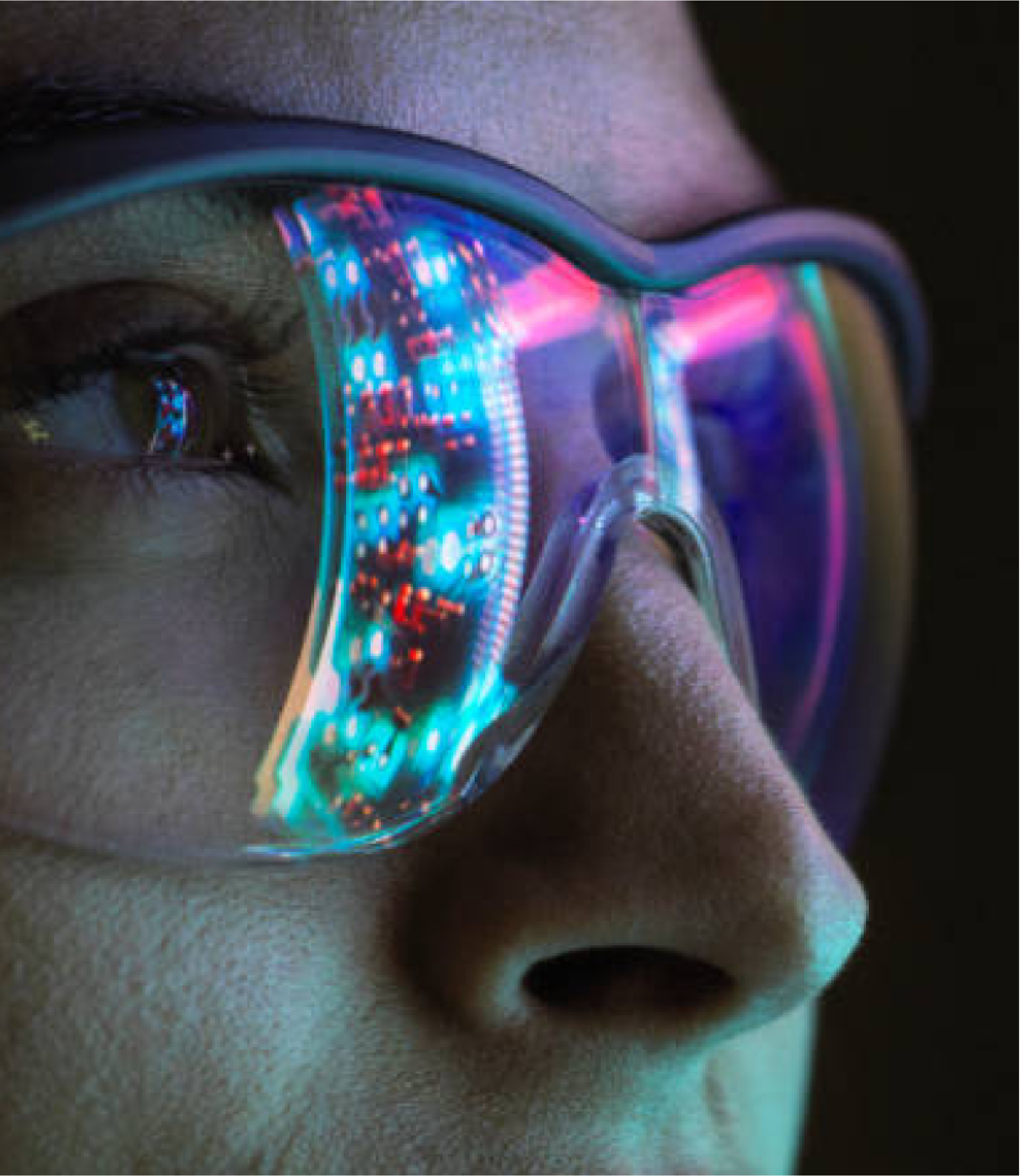
technology PHOTOGRAPHY
people & partnerships PHOTOGRAPHY
Spontaneous, warm-toned, candid and authentic. Shots that give a glimpse of the kind of personal relationship we build with our partners. One that you can trust to help you navigate consultancy and solution design, to implementation and service assurance.
Detail-oriented, connected, personalized and structured. Our photography will showcase how our platform is the one-stop solution for our customers, capturing detailed, engaging scenes where users interact with tailored solutions.
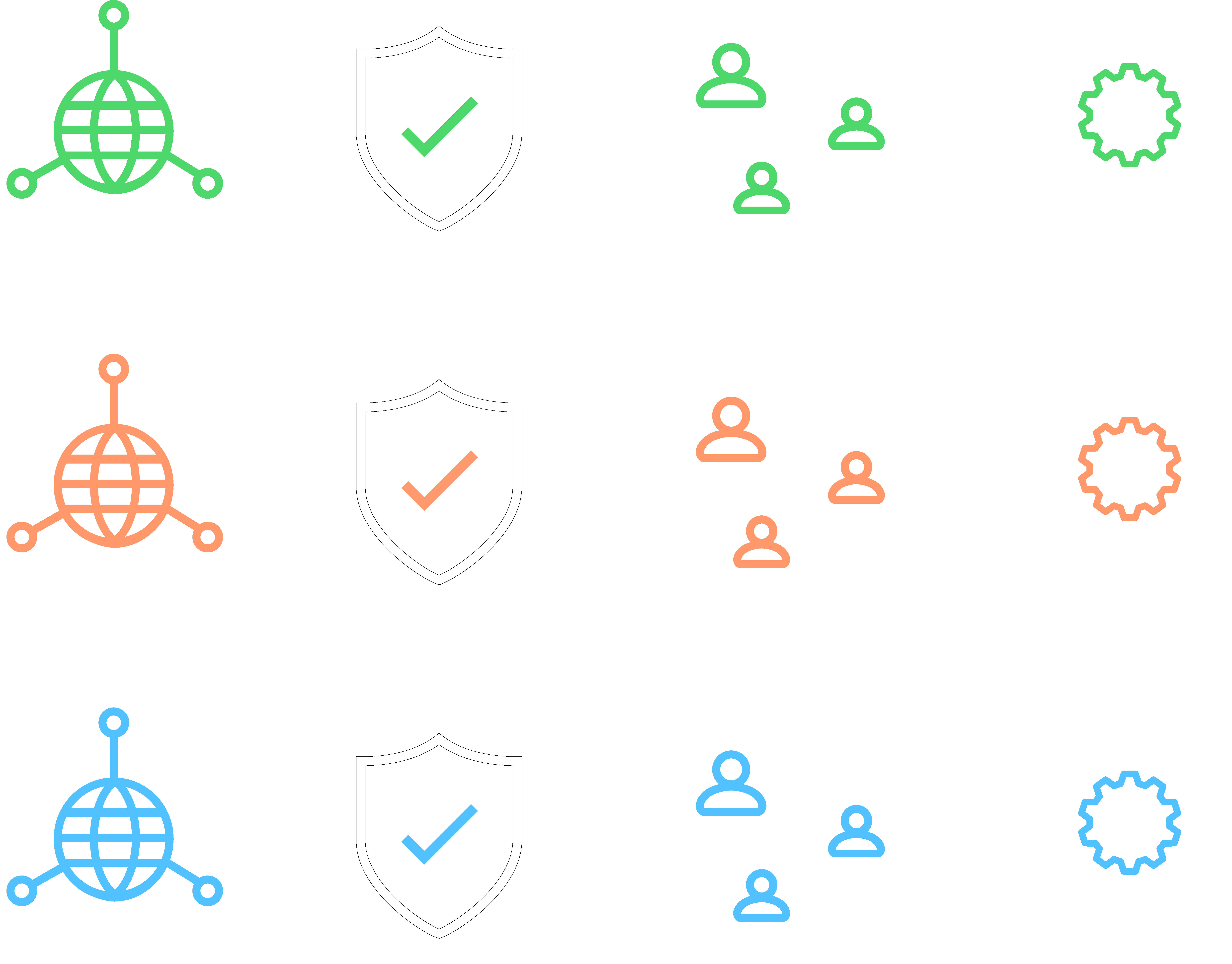
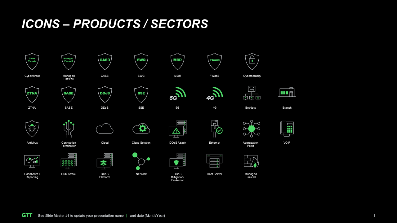
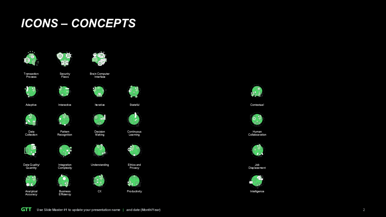
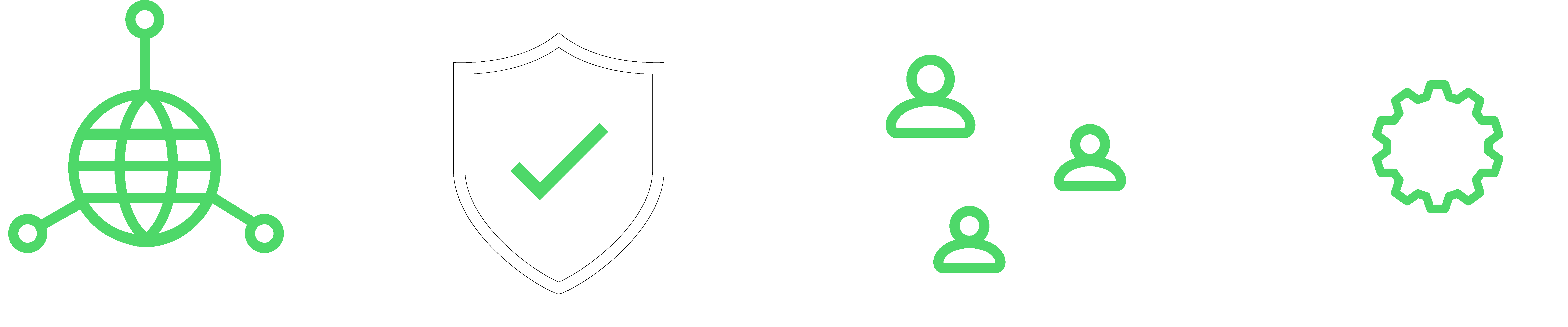
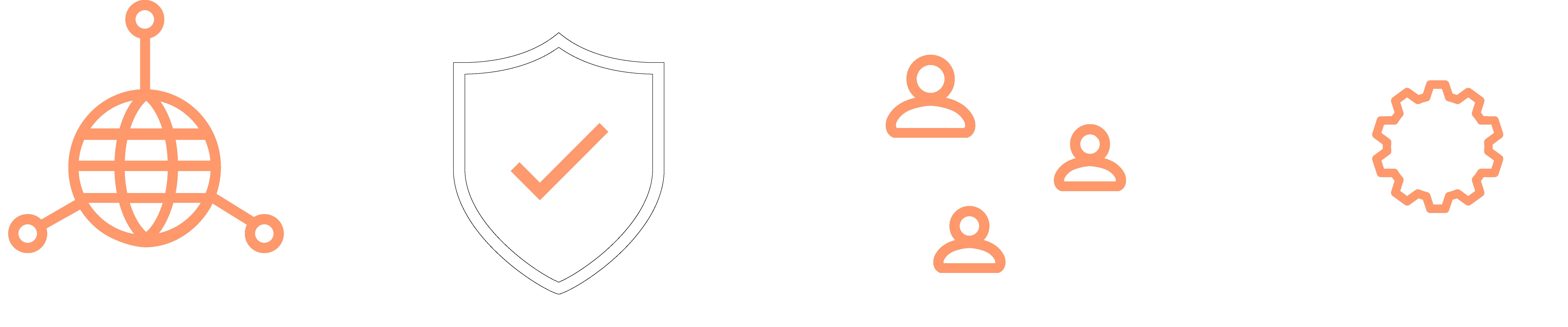
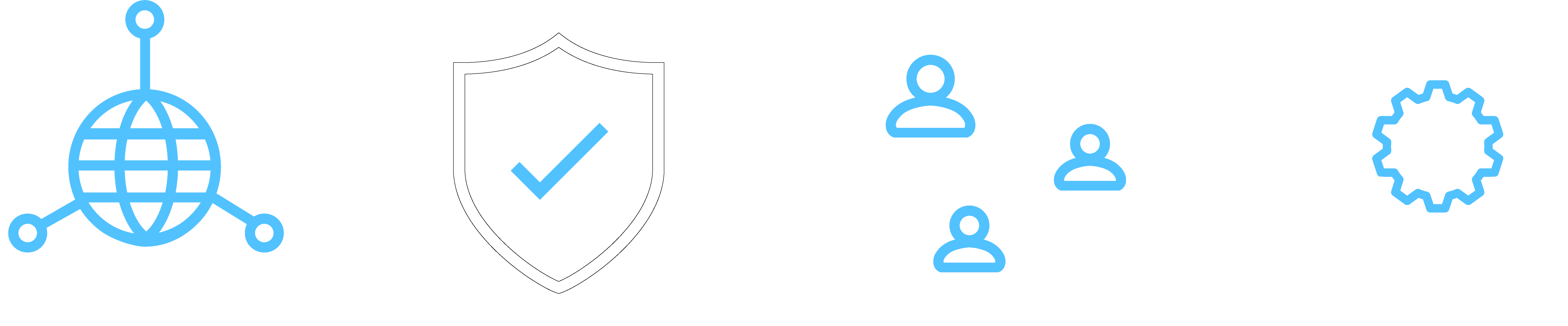
Our icon style uses black or white line punctuated with GTT Green and secondary color details. This combination of black or white and color highlights can be applied to create multiple icon colorways while still keeping the overall styling on brand. Outline thickness of these icons should always be consistent. Icons help enhance the information you're presenting by adding visual context and emphasis. They should always complement and support the accompanying text. Ensure that the icons' colors align with the color scheme of the visual assets within the text. When using multiple icons on a page, limit the palette to a maximum of three colors to maintain a cohesive and polished appearance, avoiding a cluttered or overly colorful design.
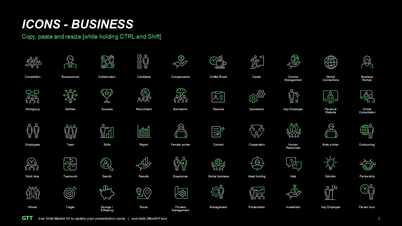
Brand ICONOGRAPHY
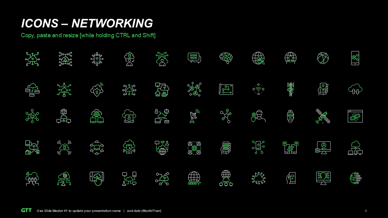
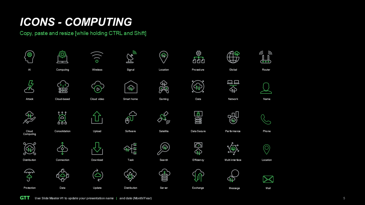
extended ICONOGRAPHY
Brand DIAGRAMS
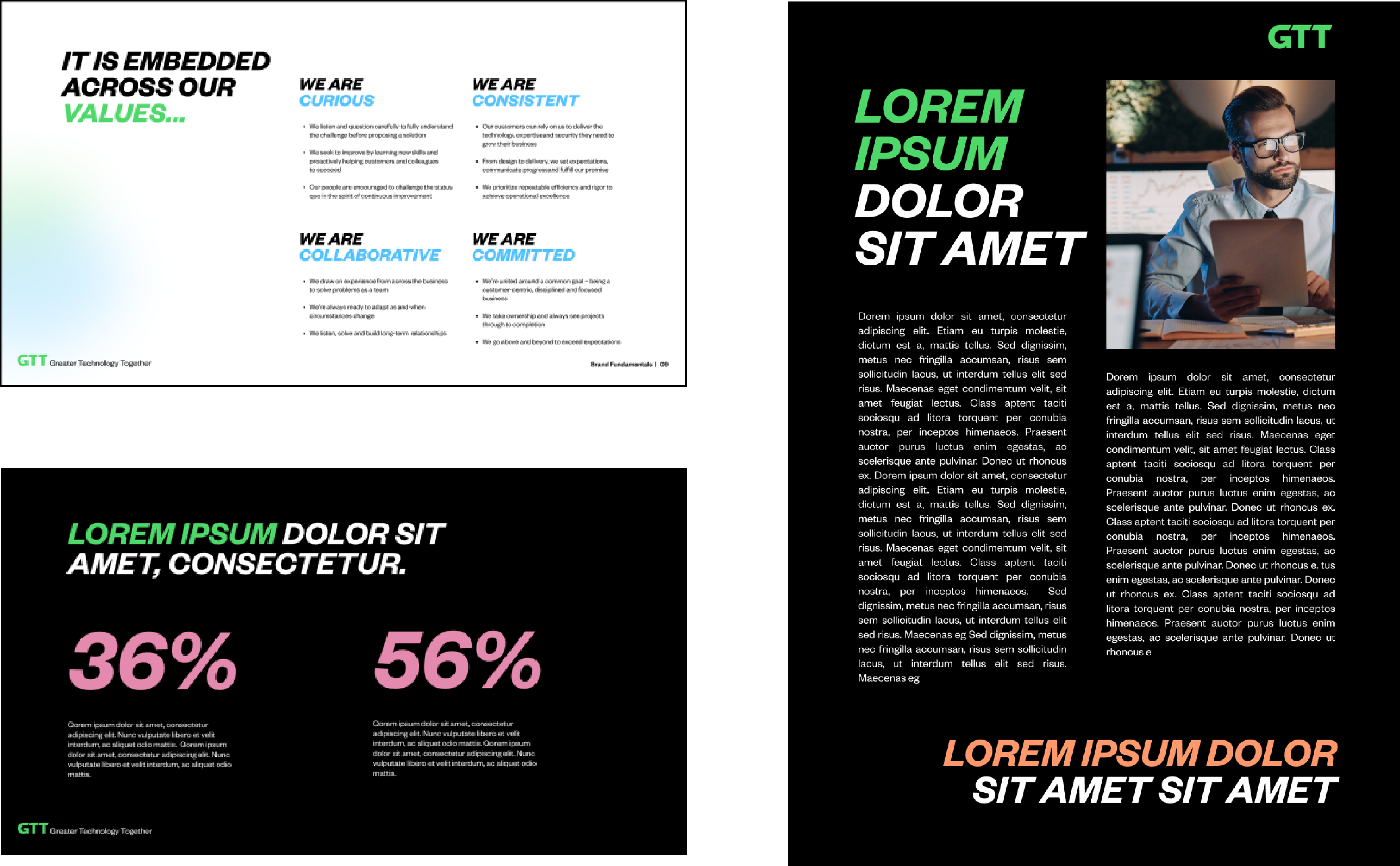
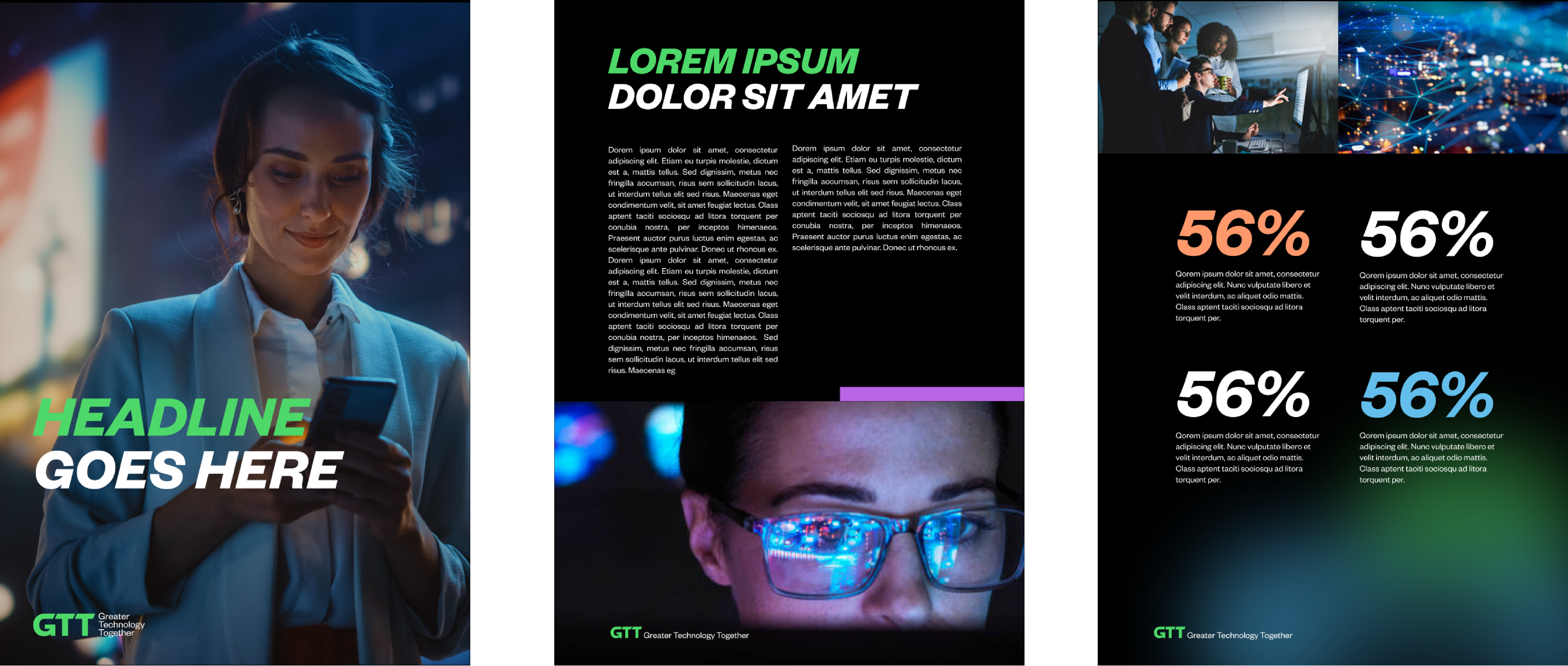
For brochures and print materials, prioritize a clear and engaging layout that combines striking headlines with easily readable body text. Incorporate color strategically, using secondary colors to create emphasis and distinguish key points, while keeping the overall layout clean and professional. Shapes should complement images, positioned subtly to avoid overpowering the content, preserving the clean, sharp aesthetic that characterizes GTT’s brand.
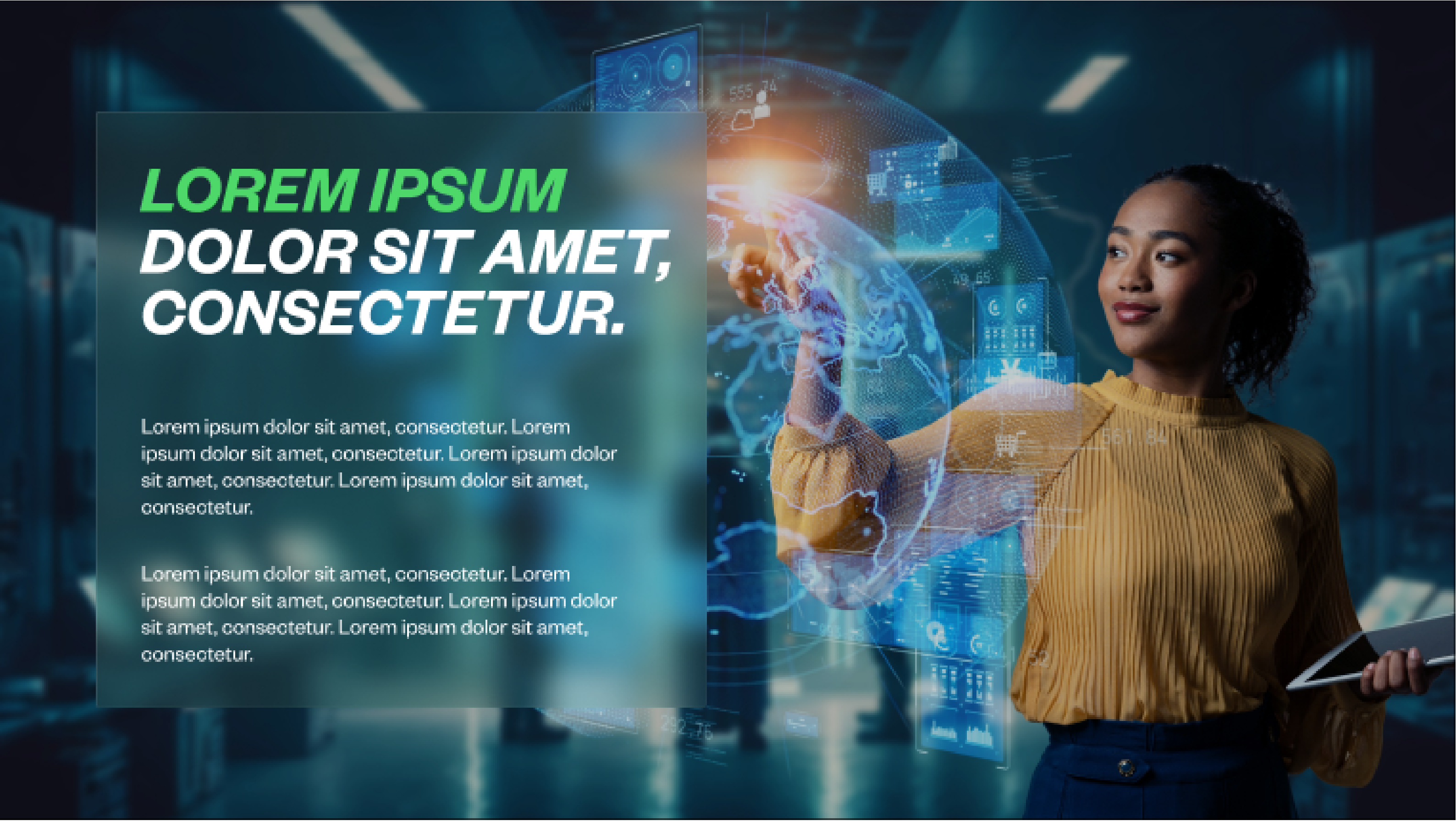
DESIGN Examples Brochure
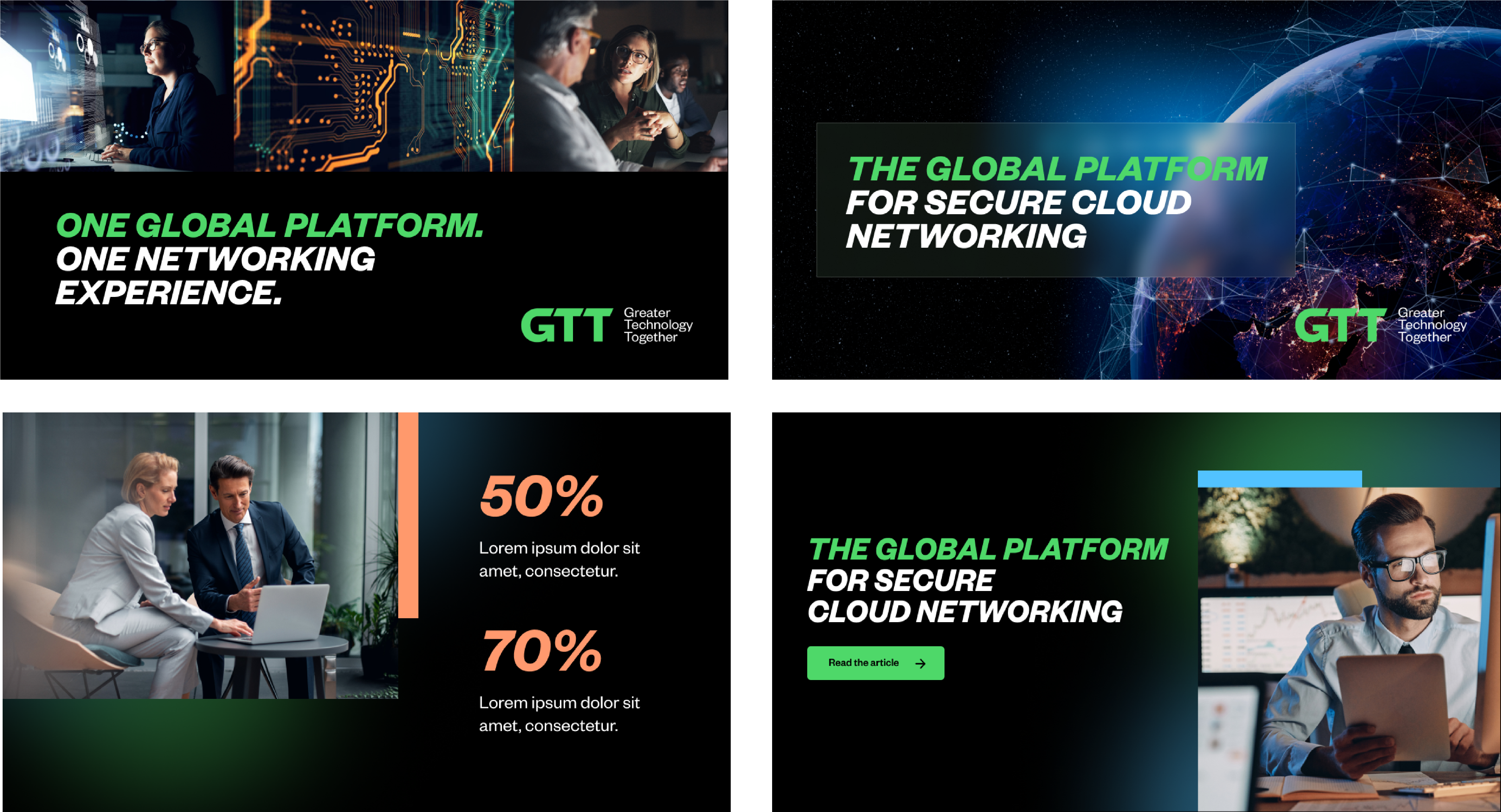
DESIGN Examples SOCIAL
For social media posts, prioritize bold, clear messaging with minimal text to ensure easy readability. Use strong visuals that reflect innovation and connection, paired with geometric accent shapes and overlays to enhance legibility and guide the eye. Maintain consistent branding by incorporating the GTT logo and a strategic use of secondary colors to create emphasis without clutter. Balance text and imagery for visual harmony, keeping the copy concise and impactful. This approach ensures engaging, professional posts that align with GTT’s cohesive and dynamic brand identity.
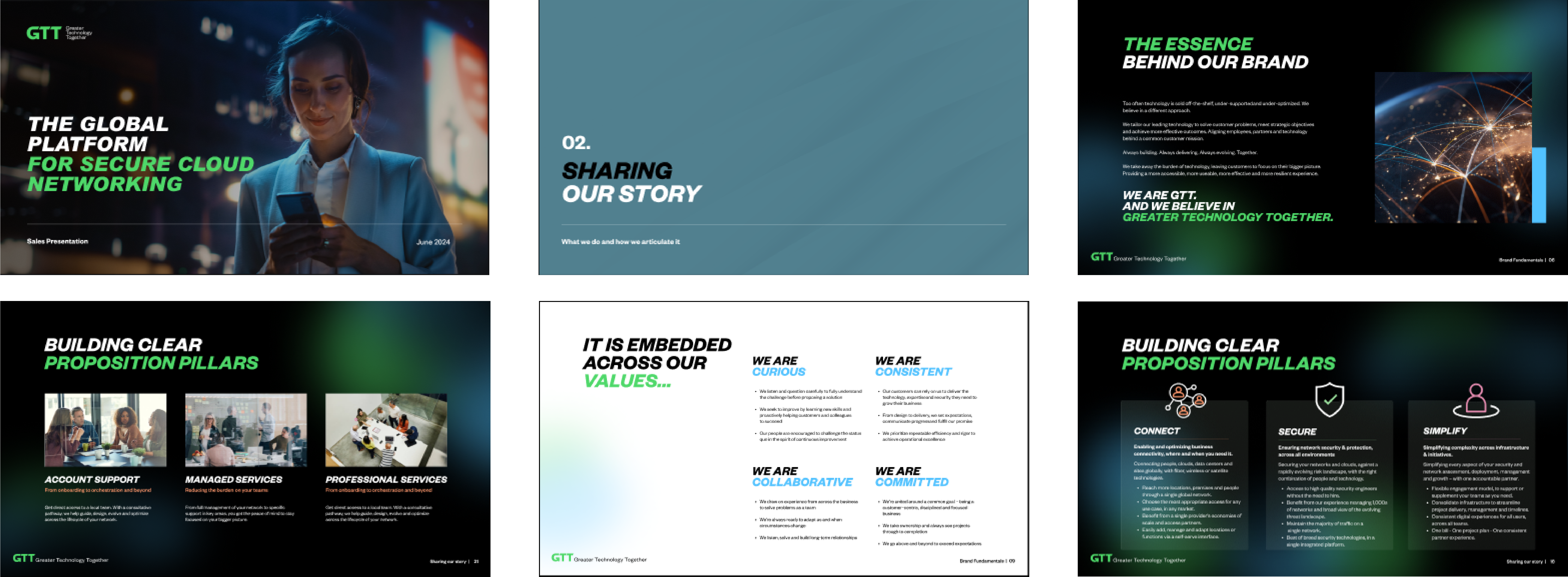
DESIGN Examples ppt
In our presentations, our layouts balance text with visual elements, guiding the audience through the content smoothly while keeping the focus on our core messaging. Key elements are highlighted with accent colors, geometric shapes, and bold typography to ensure clarity and hierarchy.
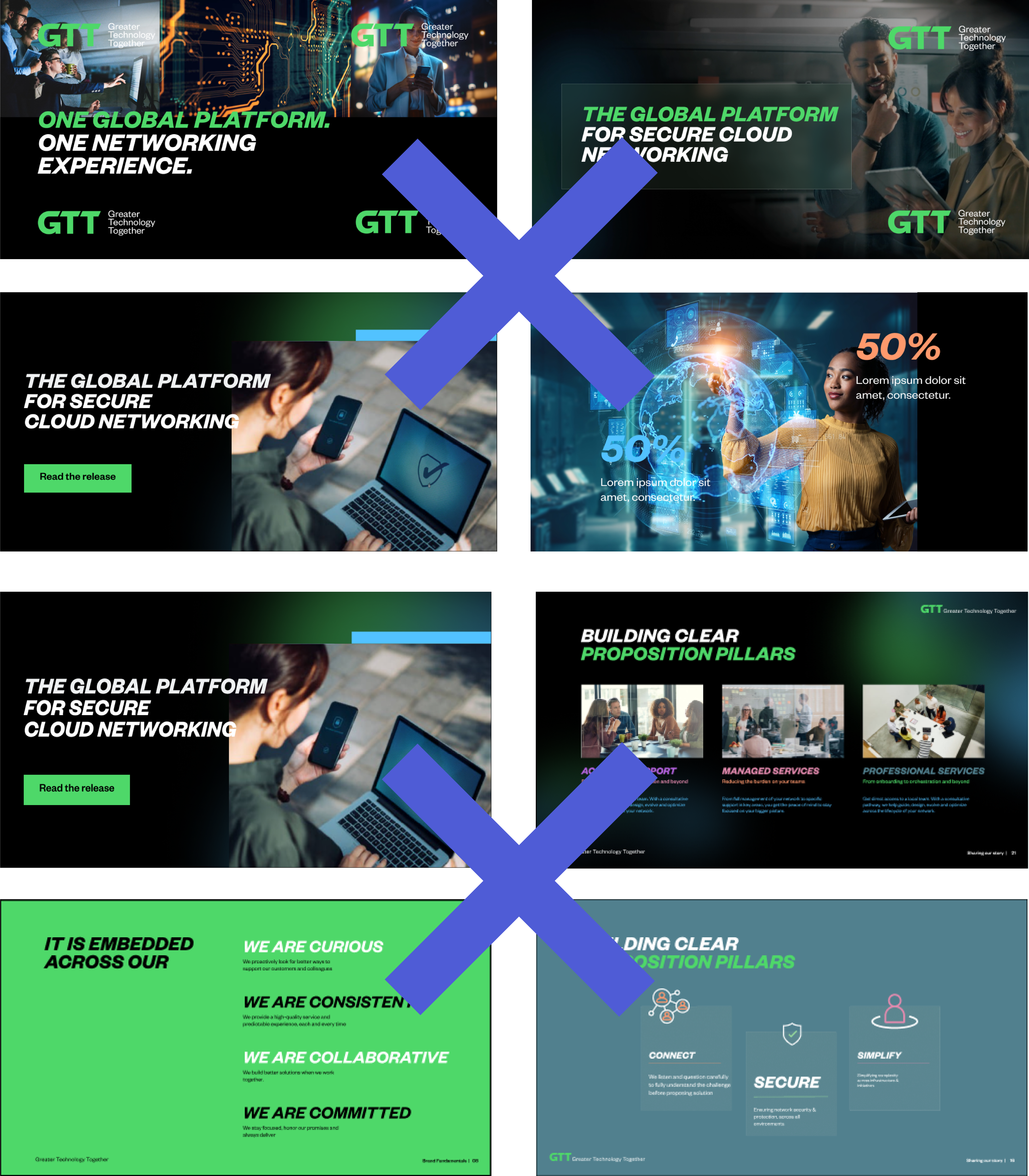
WHAT NOT TO DO
Use multiple GTT logos on one visual Overlap text over images Use heading all in one color Randomly place text and images on the grid Run text or icons over background imagery of the same color or not enough contrast so all or part of the text or icon is illegible Add a lot of text on one slide Use colored backgrounds anywhere except divider slides Use all secondary colors on one slide Use color on the body copy Use inconsistent font sizes across the pages Use "Envision" in any fomr
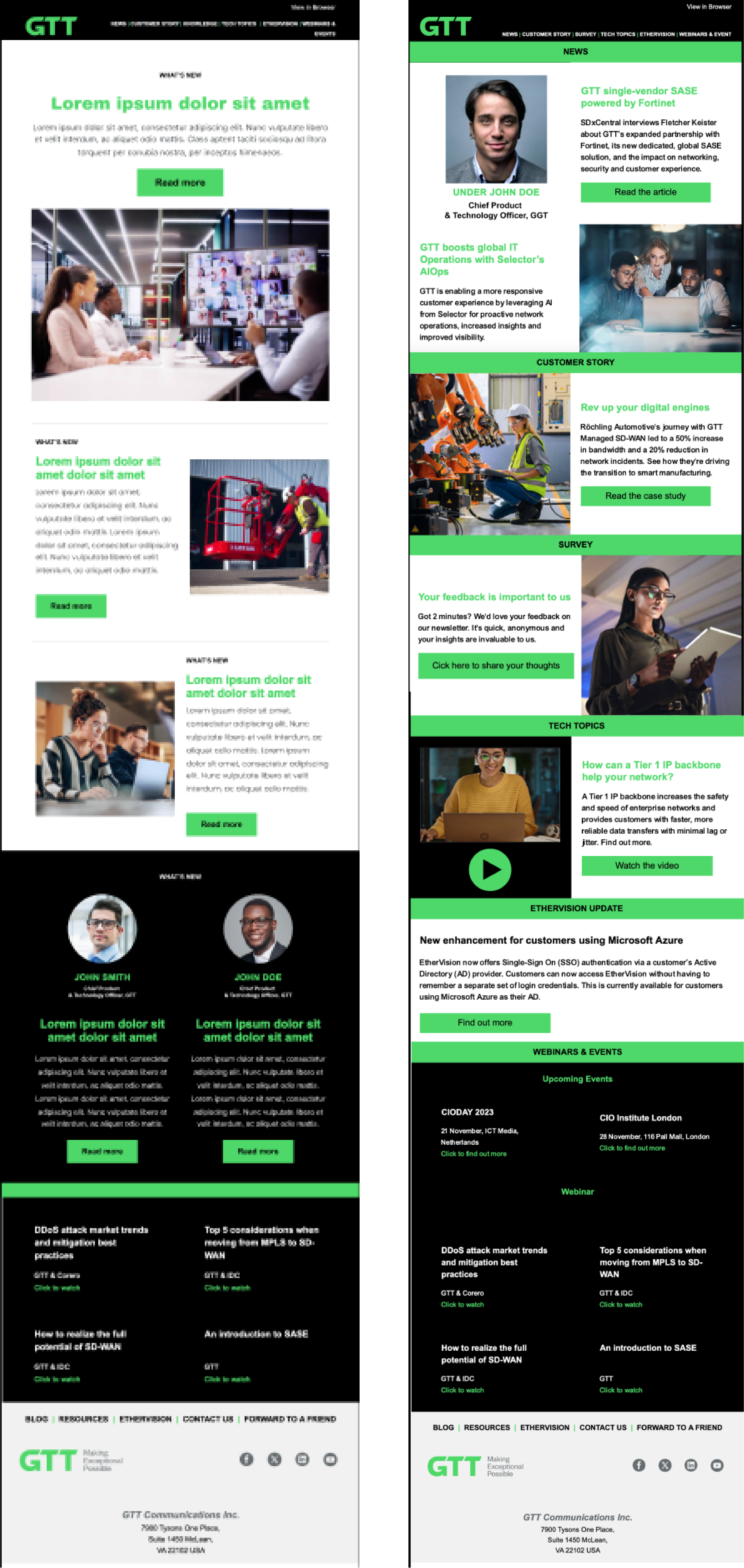
DESIGN Examples EMAILS
In crafting a visually cohesive email experience, we carefully blend technology and human photography, harmonizing colors and tones to align with our brand's aesthetic. Each image is chosen or adjusted with precision, ensuring that they collectively form a unified and appealing narrative. By utilizing stock imagery that shares a consistent color palette and style and adjusting real-life photography by softening and decreasing brightness, cooling tones and adjusting bright colors we create a seamless visual flow.
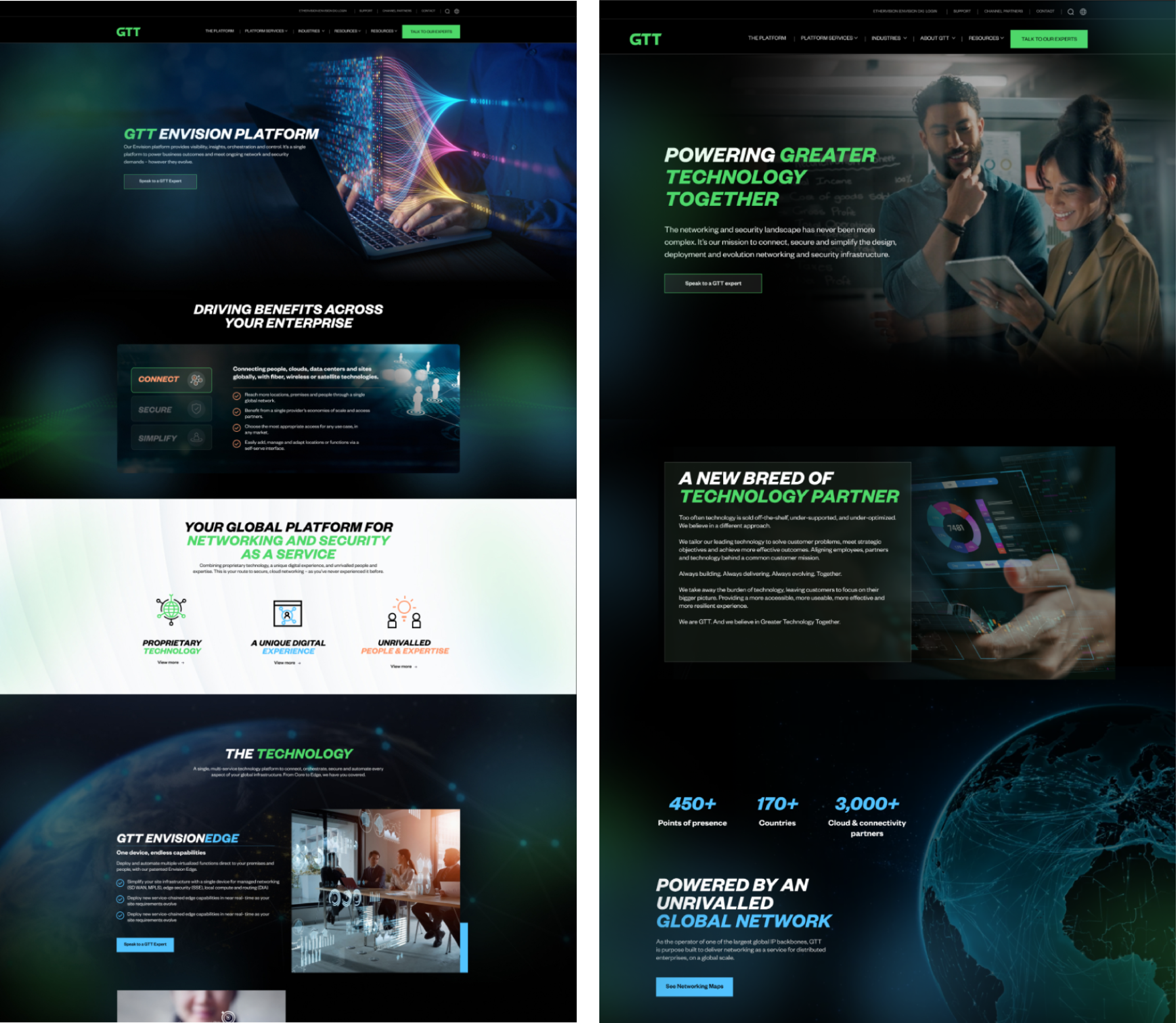
DESIGN Examples WEB
We craft a cohesive and forward-thinking web experience by seamlessly blending color, imagery, and graphics to align with GTT brand. To enhance user engagement, we incorporate animated backgrounds that add a sense of motion and vitality to the website. The alignment of these elements creates dynamic structures within the modules, guiding users smoothly across the page while maintaining a visually captivating journey. This thoughtful combination of motion, design, and structure ensures a web experience that is not only visually striking but also intuitive and engaging. Buttons are styled either as full-colored for primary actions or as outlined for secondary functions, creating a clear visual hierarchy. This approach helps users intuitively navigate through the content, with full-colored buttons drawing attention to the most important calls to action, while outline buttons subtly support secondary interactions.
Primary button style:
Default state
Hover state
Secondary button style:
DESIGN Examples WEB modules
Color
Limit the use of secondary colors to one per web module to maintain consistency and prevent color overload. On a broader scale, aim to use no more than three secondary colors per page. This approach ensures a cohesive design while allowing for visual variety without overwhelming the viewer.
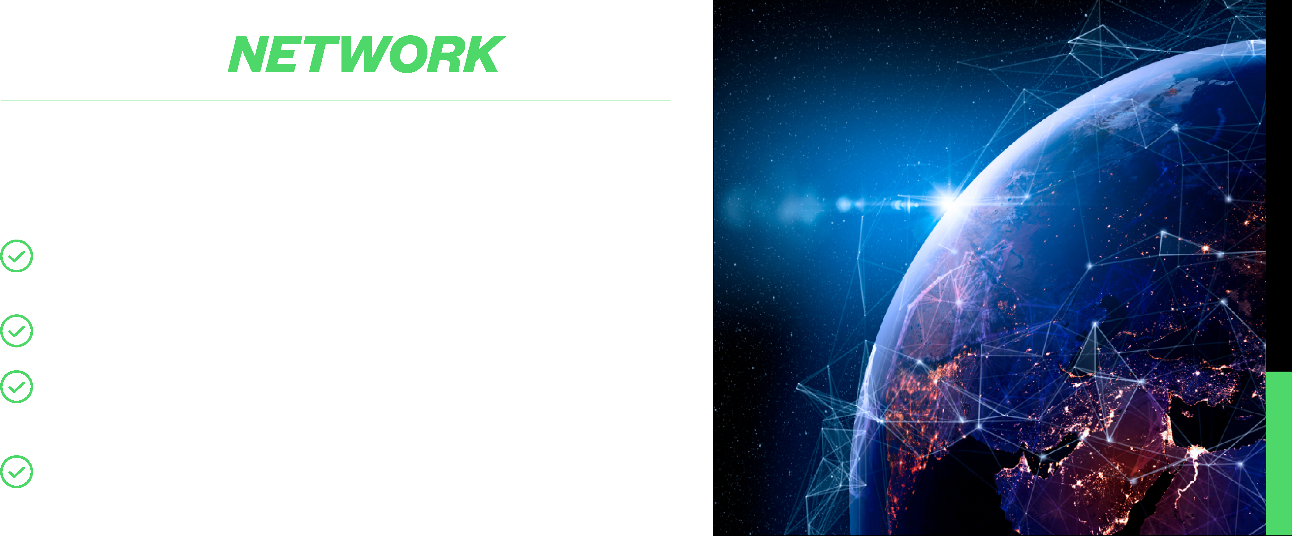
In the design layout, text is usually positioned on the left with a graphic on the right, as illustrated in the "Global Network" module. This left-to-right arrangement enhances readability and creates a natural flow for the viewer. However, to add variety or to emphasize a particular graphic, this layout can be reversed when it better suits the content, providing flexibility while maintaining visual interest.
Text and images
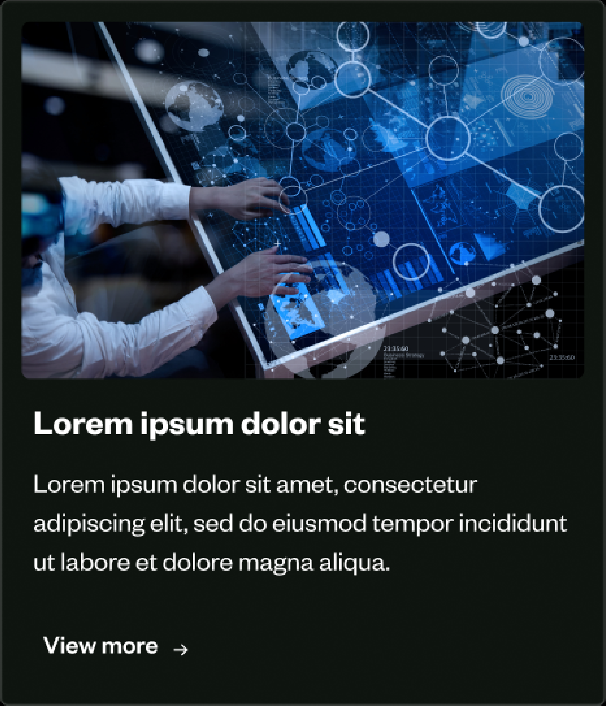
Typically, a maximum of three cards per row ensures a balanced design. If an additional card is needed, it can be centered on the row below. For cards with varying text lengths, use padding or limit text to keep card heights consistent. This keeps the visual flow balanced and prevents one card from appearing disproportionately larger than the others. Center copy when minimal text is used, while left-aligning works better for longer, more detailed content to maintain clarity and redability.
Alignment
For blurred boxes supporting text on the web, we use rounded edges with a 5px radius to achieve a sleek, modern look. The subtle rounding of corners not only softens the design but also improves the overall user experience by making the elements more visually approachable and inviting. This design choice adds sophistication without distracting from the content, fostering a sense of engagement while keeping the focus on the message.
View support solutions >
Watch the demo video >