
Pleasures Cobain Suicide Note Coach Jacket


To Arthur Bray, Chris Burnett, Tomohiko Kan, Ryder Ripps, Paul Nicholson, Dead Dilly, and David Rudnick for their contributions.
Wacko Maria x Neck Face
Comme des Garçons x
Lewis Leathers Riding Jacket


If something is seen as less human, is it less expressive though? It may not be a matter of more or less, however just different. Frustration, urgency, love, hate, vulnerability, pride, etc. are all easily translated in either approach, however something poetic happens when the words move from heart to hand. Lengths of pen stroke, size, angle, and pressure give meaning to the physical relationship between the writer and their words. In a time where digitally produced typography is an easy option, handwriting becomes a statement of importance, which may explain why many designers have returned to it in both music and fashion.
Obviously this style has been around since the beginning of writing as we know it, but what handwriting — especially loosely scrawled handwriting — signifies to us in terms of mood and expression is incredibly reflective of the time we live in. Graphically, the return to handwriting could be considered a protest. We’ve transitioned from looking at images on paper to looking at images on screens, which also means we’ve moved from hands-on production to a production virtually void of imperfection. Some might go as far as to say, the modern process has become less human.


As bubble letter writing became more refined, it quickly found its way into the mainstream, getting repurposed for commercial graphics and packaging for products like Hubba Bubba. Fast forward to present day, and the friendly, cartoonish letters are making a comeback with lifestyle magazines like SNEEZE and POPEYE. The transition into fashion at this point, seems almost inevitable as SNEEZE has already collaborated with Stüssy on a line of T-shirts featuring both brands’ distinctive logos.
The round, puffy bubble letters we know today are the invention of ‘70s Bronx graffiti writer Phase 2, who originally named his style of tags “softies.” It’s not clear what his inspiration was, however he was heavily involved in the music scene as a b-boy, DJ and flyer designer. With that in mind, there could be a correlation between Phase 2’s work and early renditions of bubble-style lettering seen at the time on albums like Rubber Soul by The Beatles.

Image shot by Pablo Lopez Luz.
Image shot by Pablo Lopez Luz.
Image shot by Pablo Lopez Luz.


Similar to Chicano, Pixado or Pichação/Pixação is a Brazilian writing style born of political unrest. It emerged during the ‘80s, a decade where the country’s transition into democracy coincided with a widespread interest in heavy metal bands like Iron Maiden, Metallica and AC/DC. The youth of Brazil took inspiration from the UK/U.S.-produced album artworks of these bands to create an aesthetic entirely their own, which they later took to the streets to express angst they felt towards their cities. Though Brazil has had a lengthy history with political writing on walls — especially São Paulo — the sheer amount of writing grew exponentially following the refinement of Pixado. To the point where, without exaggeration, almost every visible wall in the city was covered.
Stylistically, the writing shares similarities with Chicano — stark, varying black lines with sharp angles. However because Pixado is not only about anger but also exposure and fame, placement can become quite competitive and daring. It’s not uncommon to see writers risk their lives to climb between windows to paint entire sides of low-rise buildings. This embodiment of angst, disapproval, need for expression and visibility are what make Pixado style especially relevant now. It may be only a matter of time until it makes its way from walls to shirts.


Chicano as a term has a range of meanings, but for the most part it refers to those who identify as Mexican-American. The name itself however, is complex — a response to political, social and economic difficulties endured by Mexican immigrants, primarily on the West Coast. As a group forced to replace their traditions with those of Anglo-Americans, a sense of identity, community and means of expression became vital. This drove Chicano and Chicano gangs to writing graffiti on walls as an announcement of who they were, the injustices they endured, the culture they stood for, and the streets they owned.
Aesthetically speaking, Chicano manifested into its own unique style distinct from most traditional graffiti. The stark black strokes, sharp lines and accents are visual cues from Gutenberg era’s Old English typefaces. Considering the uneasy state of current affairs in the U.S., and a revived interest in black lettering, Chicano writing sits in an interesting crossroads. It is politically charged and graphically relevant. With plenty of Chicano influence already in fashion, it’s sits perfectly in line to be picked up by designers next.


Nicolas Jaar album
art by David Rudnick.
Evian Christ album art by David Rudnick.
Sourced from http://void.davidrudnick.org/


Not a genre of typography but rather someone who has created a style all his own, David Rudnick’s work sits outside the formulas of present day visual culture. The designer works almost entirely in custom-designed fonts which appear outwardly historical yet futuristic. Familiar yet unplaceable. His unique aesthetic is one which is set to slowly disrupt the commercial industry, as you may recognize from projects like streetwear brand Wil Fry’s logo, Evian Christ’s logo and Nicolas Jaar’s album art. However, it is important to consider the future of typography is not solely visual, but also practical. In a conversation with Rudnick, he mentioned the next major shift would rely on “radical originality and superior craftsmanship.”
The average consumer’s eye is better trained than ever to recognize plagiarism, which when combined with social media means more and more designers are being exposed for lack of originality. Not to mention the sheer volume of images we are presented with every day has increased exponentially, making it easier to spot trends which have become exhausted. The next wave of fonts in fashion could bring anything, but it would likely depend on a new approach to conception. One which may be similar to Rudnick's.


Dead Dilly is a Toronto-based graphic designer with ties in streetwear and music, having worked with artists like Childish Gambino, Harrison Brome, Jaden Smith and BJ The Chicago Kid. His other projects cover a range of logo designs, movie poster layouts, clothing and packaging.
Redacted NASCAR logo as seen on Frank Ocean.
Redacted Yeezy logo by Dead Dilly.
Metallica shirt by Dead Dilly.


There is the obvious example of the Metallica tour shirts becoming a uniform during the recent resurgence of metal aesthetic in streetwear. The problem here is evident: Most (if not all) of the core values of the culture are not celebrated. It is a shallow appreciation of a selected component that lacks the activity to benefit either party involved. To illustrate this point, in 2015 I created a highly redacted Metallica shirt (above). I encouraged those who bought a shirt to use the shirt as a canvas to destroy, this was my attempt to force the consumer into interacting with the anarchistic freedoms of metal culture.
More recently, Frank Ocean had put out a shirt with a redacted NASCAR logo to brand his latest project. I believe this kind of anti-design trend is a powerful undercurrent in streetwear that could come to prominence and change the way we absorb trends. Of course, it is ludicrous to ever expect full appreciation, but maybe the removal of distinction will cause us to dig a little deeper.
I don't find it that exciting to predict the next culture to have their aesthetic appropriated into streetwear. I think a much more essential perversion is: How can we celebrate the form of these shapes without an empty attachment to the context? This can be accomplished through the extraction of comprehensive letterforms entirely, leaving behind the frame/form of 'word.' Herein lies an interesting paradox where the removal of word actually results in stronger communication between origin and consumer. The consumer is now challenged with questions 'where have I seen this before?,' 'why is this nostalgic?' or 'who created this?' These questions create a dialogue that is simply nonexistent when the answers are (literally) worn in plain sight.


Helvetica Bold,
ACRONYM.


College Bold,
OFF-WHITE.
Helvetica Bold,
N.D.G. Studio.
DIN Condensed,
SS17 Juun J.
Helvetica Bold,
Nike ACG.


Aphex Twin logo designed by Paul Nicholson.

Paul Nicholson is an artist/designer who's body of work is streamlined by a fearless attitude. This fearlessness has manifested into the bold, futuristic and highly visible graphics he's become known for, making him a mainstay in clothing graphics and the music industry. You may recognize him, for the development of the iconic Aphex Twin logo.
I would be lying if I were to say this typeface or that logotype is going to be the next big thing in fashion. I have a deep interest but would not label myself as any kind of soothsayer. However, I have always been drawn to things at the cutting edge, that are progressive and futuristic. As such, I tend to gravitate to scenes as they first develop and tend to pick up on things early. One shift I am aware of is possibly in part to do with the uncertain times that we live in. Is it a reaction or a reflection? I couldn’t say but there are dark undercurrents. Many labels are taking on a look more akin to a paramilitary organization or security firm. This utilitarian/military chic requires a clean, functional approach to typographics with no place for extraneous decoration. There are two fonts that stand out as meeting this function, not fashion requirement - Din and Helvetica. The use is stark and minimal taking on the graphic look of pharmacy packaging or military labelling.
Much of the interest surrounding typography in fashion is regressive. It is easy to take from the past and simply reappropriate iconic and classic design. Whether it be band graphics, heavy metal style fonts or the wholesale lifting of logos such as DHL, Champion or Thrasher. To be honest, this constant regurgitation of the past does nothing for me. Label it clever, ironic or postmodern, but most of the time it’s just browsing on Google and lifting something. If you don’t add anything to the mix or give it your own twist, then what’s the point? On a deeper level, I feel that once certain logos and graphics have been through the fashion machine, its original significance and meaning gets lost. How many people wearing a Ramones, Joy Division, or Dead Kennedys shirt know anything about the music or the people that created it? Is it cultural appropriation for a 16-year-old kid to buy a punk shirt? Maybe I am missing the point, but I thought the reaction from Cradle of Filth to Kanye wearing their shirt kinda backs up what I am saying.
There is a growing trend for a utilitarian and militaristic aspect to what people wear. Fashion is no doubt responding to images we see on the news, movies and in computer games; Syria, The Bourne Identity, anti-terrorist squads, Call of Duty,
The Expanse, etc.

Homage Tees.
Vintage Big Dogs.


Image by da share z0ne.
Image by da share z0ne.


Ryder Ripps is a conceptual artist, and creative director at the agency OKFocus based in New York. His work is often seen as social commentary about life online and off, shamelessly confronting his audiences with truths they'd rather avoid. You may recognize him for his warped paintings of Adrianne Ho.
“Bad” design is going to be the next cool thing — stretched letters, mixing loud and ornate typefaces that don’t match, and abusing drop shadows and stroke use. The sort of design you’d see with ‘90s brands like Big Dogs, or in graphics from the modern day “meme-o-sphere” that have an amateur quality to them, yet something sincere. I think this style is in the collective consciousness of both the designers and the viewers, it’s relatable in the same way early internet graphics are. There’s something human about it. Not corporate, but genuine and funny. And amongst a landscape of “good” design, “bad” design is eye catching and fun.

Predator.
Blade Runner.
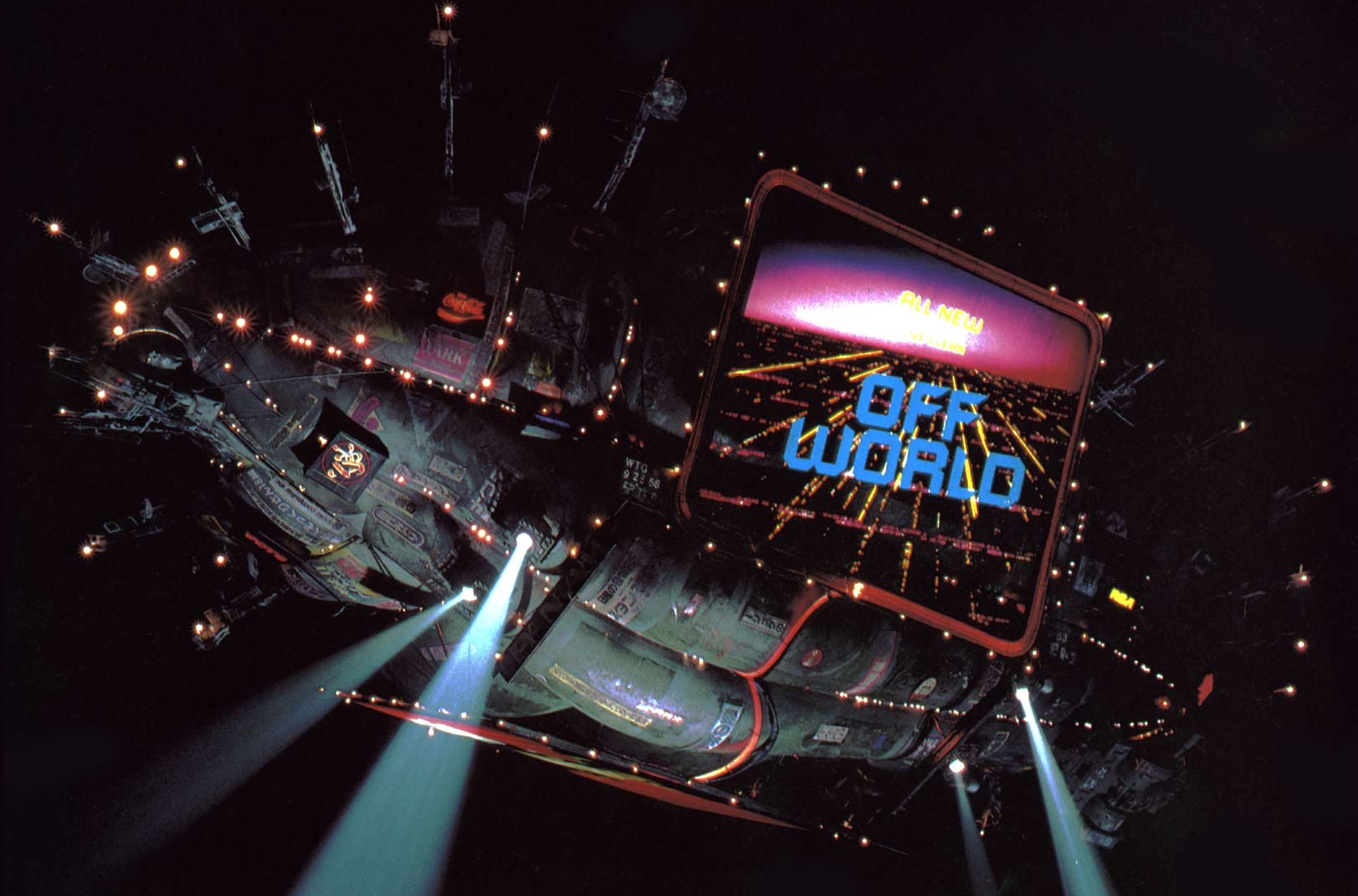


I think in the near future, we will see a revival of eighties digital aesthetic. We’ve already been seeing the comeback of video game logo designs but this retro futuristic design is especially inspirational. The idea of something esoteric, occult is very exciting.
Editor’s Note: Pop culture’s latest obsessions have been bringing sci-fi into the mainstream with the widespread popularity of shows like Westworld, a remake of the ‘70s movie, as well as Ghost in the Shell, a remake of the ‘90s anime from Japan. To see visual references from these eventually make it into fashion, would be no surprise especially given their esoteric or cryptic nature as Kan mentioned.
Enter the Void title sequence by Tomohiko Kan.
The Police’s Ghost in the Machine cover was designed in the early ’80s and released October 2, 1981. I was just a kid and my older brother was going through some music magazines when I found this cover, so pure in its design. In the early eighties all the covers were colorful and very “pop.” This design was futuristic with its digital LED, appropriate since at the time people were thinking about the 21st century and new technologies. Those new technologies were often associated with Japan, which drove interest in Japanese Kanji typefaces — a new kind of sign, evocating synchronicity, and the future.
I discovered 30 years later that these red LEDs [were not distorted numbers or letters, but rather] represented the three band members with their distinct haircuts. The band couldn’t settle on a photo for their album cover, so they decided to go with this illustration which I think is very clever. Andy Summers is on the left, Sting is in the center with three spikes for his hair, and Stewart Copeland the drummer with his fringe on the right. The concept is very good and simple, the result is brilliant. A year later the movie Blade Runner was released giving an incredible, unseen vision of society. We were hypnotized theaters! Few years later, the 1987 movie Predator used the same kind of LED digital typeface in the autodestruction countdown scene!
Tomohiko Kan is a director, photographer and graphic designer based in France. He is perhaps most well-known for his work on Gaspar Noé’s famous title sequence for ‘Enter the Void.' The piece has become a staple source of inspiration for other designers (especially in the case of this music video), embodying an overwhelming number of references to other famous films.


Chris is a graphic designer from Portland, Oregon who previously worked with the LA agency that handled Odd Future’s site, apparel and promotional graphics. His work includes the hugely recognizable dripping OF logo tee.


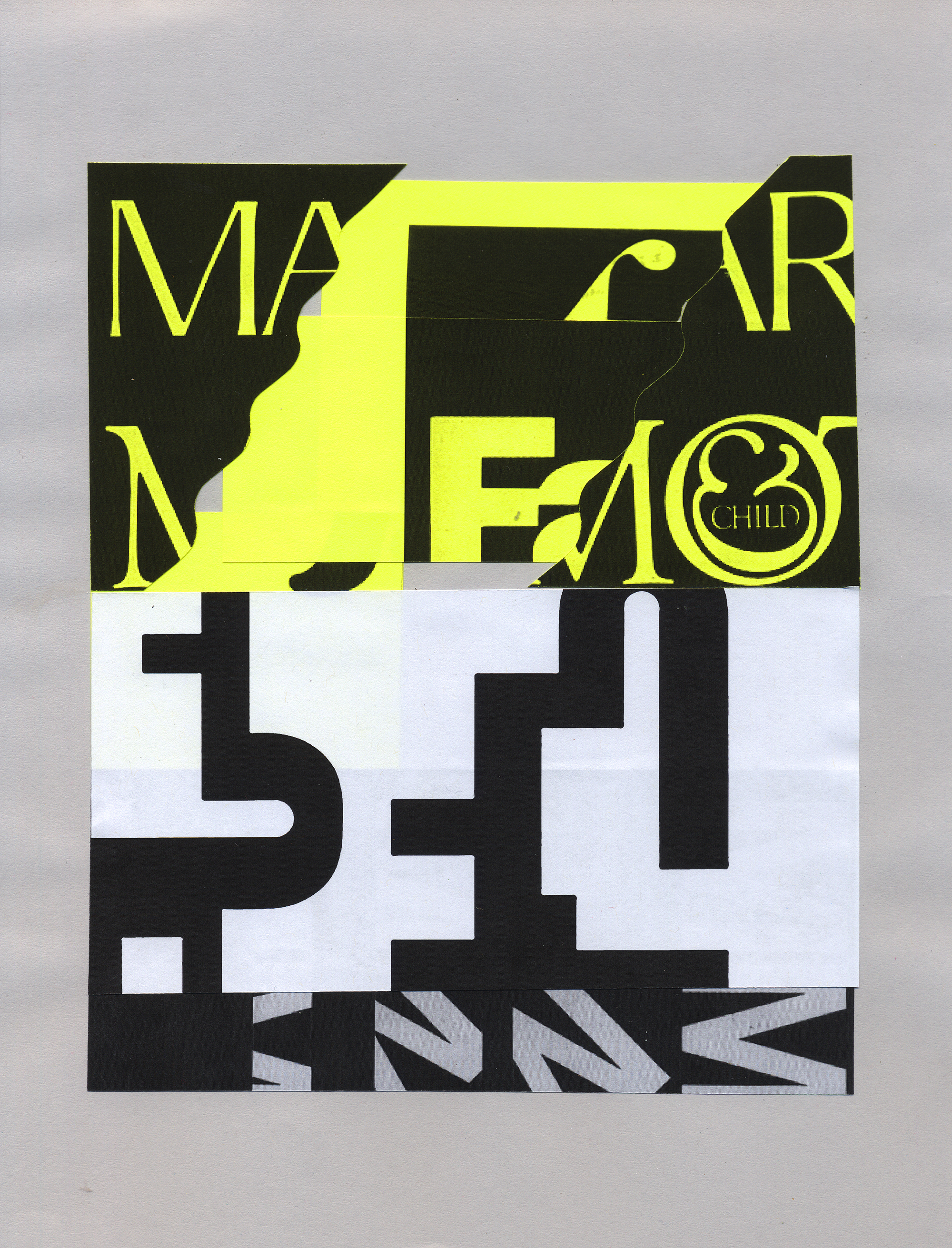
Above collages by Chris Burnett feature the iconic work of Herb Lubalin and Wim Crouwel.
We’ve also been seeing it in streetwear with brands like Golf Wang making use of typefaces as accessible as Arial or Supreme using its Barbara Kruger style Futura in the red box which has been a classic for years. Madbury Club has a style all their own, often referencing retro Swiss logos, Beyonce’s Ivy Park collection is plastered with big bold letterforms, almost yelling the brand name at you. Same with Alexander Wang’s H&M collection. Today, it’s better to tell people who you are with big bold branding, instead of having them dig for the details.
As our culture and tastes continue to evolve, we need to not only look to the future of type, but also the work of those who came before us. Herb Lubalin was a pioneer of bold typography – his work so strong and timeless, it could be mistaken for having been made today. Wim Crouwel’s as well, with his grid-based approach to letterforms that served a purpose and only did what was needed. This return to the basics is hot on the heels of a culture plagued by excessive visual stimulation. As a result, the art and typography of the future will be far more classic and heavily rooted in the time before everything was at our fingertips. To evolve, doesn’t always mean to go forwards.
As it stands now, artists have an array of platforms to say whatever they want and connect with fans. This is great, but now we’re seeing an over-saturation of content leaving us paralyzed with the decision of who to click or tap first. In order to cut through the rubble, I’d say art and typography will become far more simple, utilizing bold headlines and clean treatments. This means a classic approach to words and titles – not void of expression, but teeming with sophistication and strength. We’re seeing this now, with simple album art like that of Frank Ocean’s Blonde, or Bon Iver’s 22, A Million, and The Weeknd’s Starboy.

Forever21.
Kanye West's Life of Pablo merch designed by Cali DeWitt.
Cali DeWitt's Romy Schneider memorial sweater commissioned by 032c.
Chicano gang writing.
Cali Thornhill DeWitt and Brendan Fowler's label, Some Ware.
Gutenberg's Bible.


Perhaps the unsung hero of fashion, typography is one of the major design elements dictating how a brand can define or redefine itself as well as every garment it produces. Letterforms used in logos and seasonal designs convey more than what is written in words — they imply a time, place, feeling and attitude. However, as with anything related to design, comes a fight for authenticity. There will always be those who tiptoe a respectful line of homage, parody, or commentary and others who will blatantly plagiarise. Deciding who sits where is endlessly debatable. Is it original for Gosha Rubchinskiy to use Thrasher’s ‘Banco’ font, but not Forever 21 and where is the distinction?
Appropriation is nothing new to fashion, but in the advent of all our sharing platforms, how fast that appropriation happens and what impact it actually has on changing visual culture seems more daunting than ever. Heavy metal fonts originally associated with aggro long-haired guys who were true fans of Metallica are now being worn by under-aged “Beliebers.” While on another hand, black lettering from Gutenberg’s printing press days became the choice aesthetic for West Coast gangs, Cali Dewitt’s “Romy Schneider Memorial” sweatshirt and finally Kanye West’s ‘Saint Pablo’ Tour merch, not to mention its regular place in Vetements. In a time, where most designers feel as though everything has been done, where else is there to look, and what reference could be the next big thing for fashion? We began to explore the question alongside industry designers Chris Burnett, Tomohiko Kan, Ryder Ripps, Paul Nicholson and Dead Dilly.

