
How it works
Request a demo
NEXT

The Data Inputs option allows you to import additional data into your existing pipeline (e.g., from Excel spreadsheets or new cloud locations).
The tool offers several methods �for filtering, segmenting, and changing the granularity level of your emissions data.
Marginal Abatement Cost Curve (MACC) is a critical analysis to understand options of decarbonization levers for your company, with business case and abatement potential. With the tool's tailored MACC dashboard, you can easily prioritize the most cost-effective levers for you
The bars on the MACC chart represent the decarbonization levers relevant to your company based on your emissions data. Each bar’s width represents the abatement potential (x-axis), while the height represents the cost (y-axis).
In this example, the tool has identified an Industrial lever with an abatement potential of 120tCO2e at a cost of -750USD/tCO2e, which makes it an attractive initiative to prioritize for near-term decarbonization.

To precisely measure your carbon emission baseline and abatement potential, you can leverage the Catalyst Zero Factor Library, an extensive decarbonization lever database with 750+ materials' value chain digital twin. The database is developed and maintained by over 600 McKinsey experts.
Welcome to Catalyst Zero
Catalyst Zero is a proprietary McKinsey tool that helps your company accelerate its decarbonization journey and achieve net-zero targets.
Ready to decarbonize your company activities?
Contact our team and request a �Catalyst Zero demo today!
Request a demo


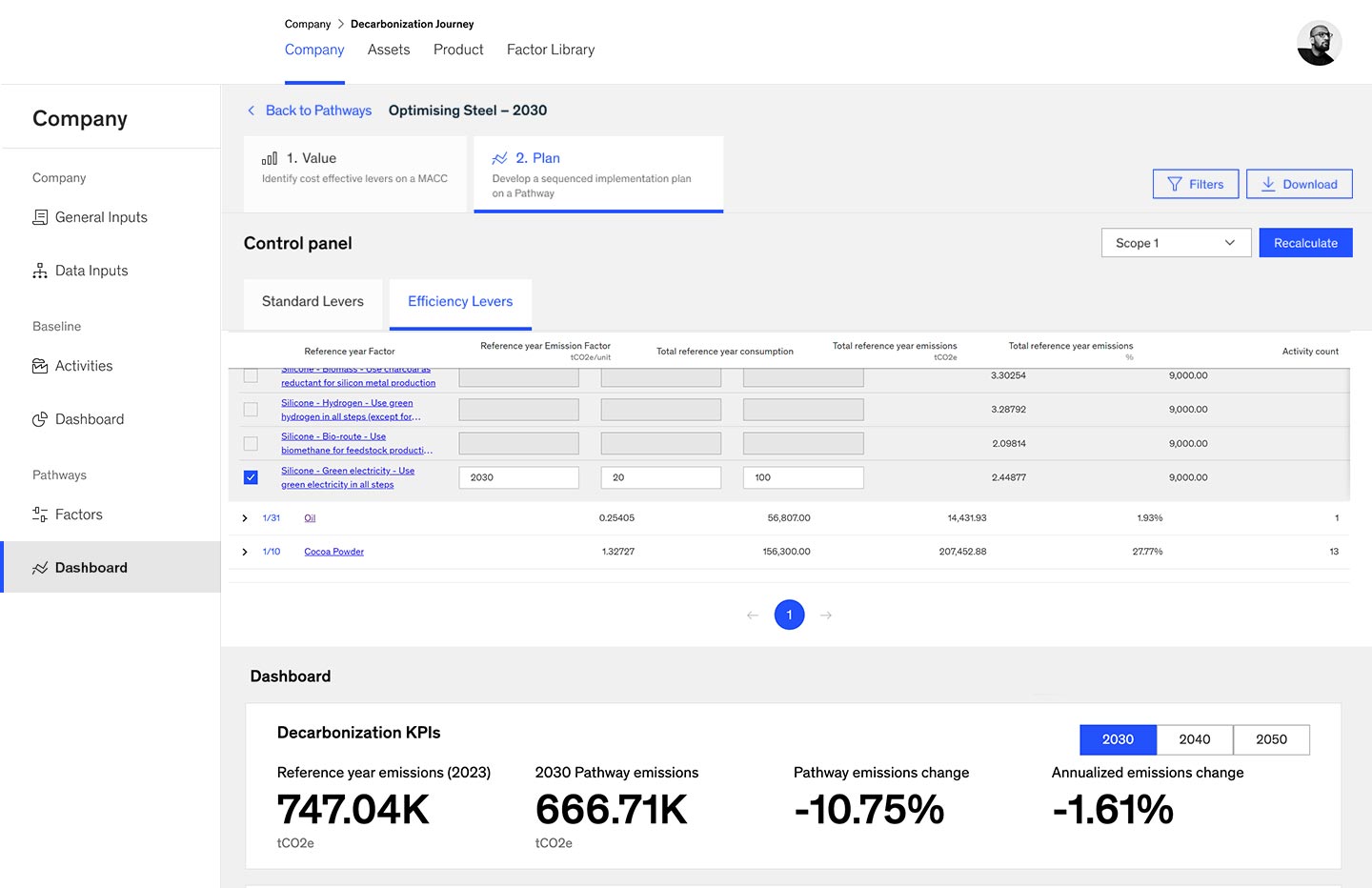
After the menu of options has been examined, �next, a company will need to establish a concrete plan and sequence levers into a feasible pathway. Decarbonization pathways are scenarios designed �to monitor your company’s emissions overtime, incorporating your selected decarbonization levers
Via the Control Panel, you can select one or multiple levers to see their individual or cumulative effect on your current decarbonization pathway.


NEXT

BACK

NEXT

BACK

NEXT

BACK

NEXT

BACK

NEXT

BACK

NEXT

BACK

NEXT

BACK

NEXT

BACK


Reset


NEXT

BACK

The Baseline dashboard visualizes your current emissions data, which it pulls directly from your company's systems via an automated data pipeline (e.g., company ERP, cloud storage, and data lakes).


You can also visualize your emissions pathway and compare BAU against the target scenario. Using the tool's suggested levers, your company can optimize its costs and track its target level of decarbonization.
NEXT

BACK


